Building brands that make ideas tangible through design and storytelling
About
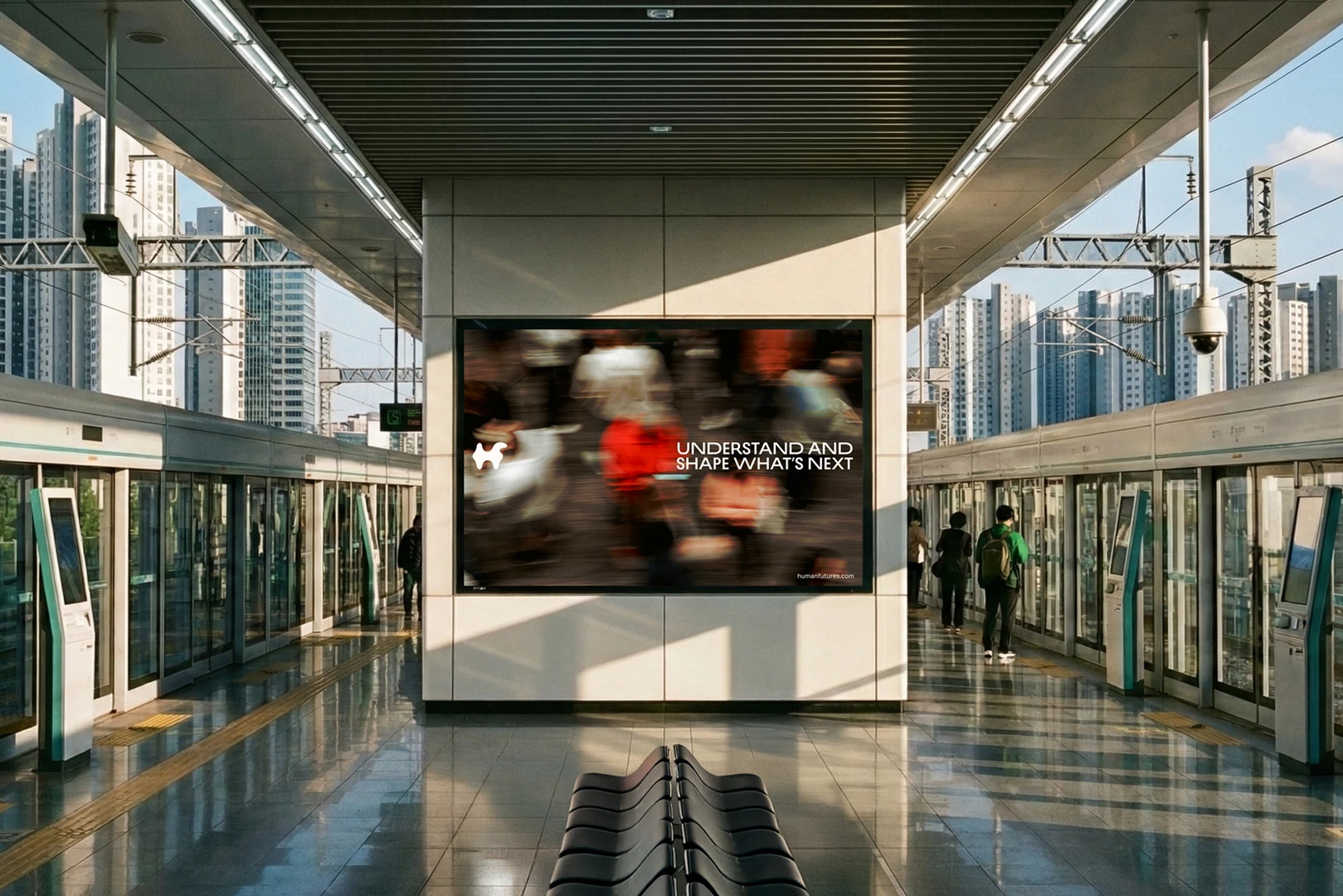
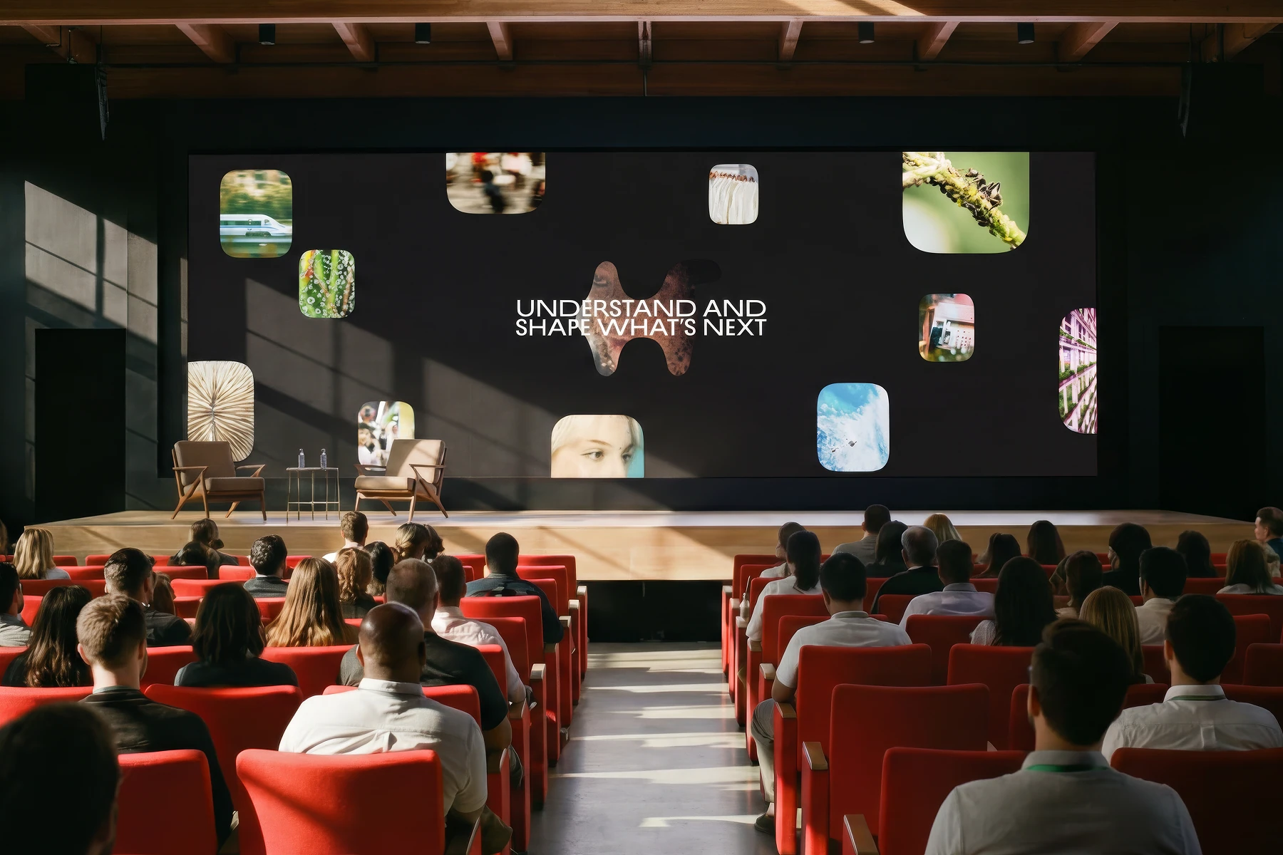
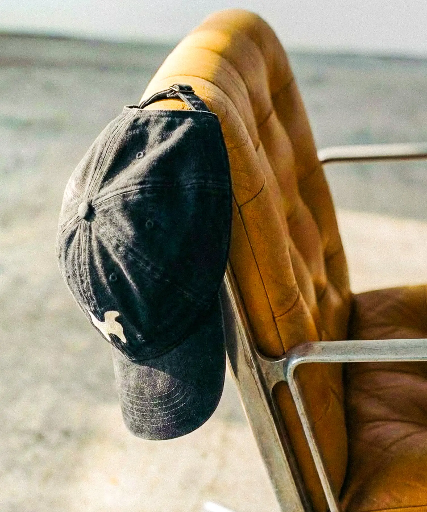
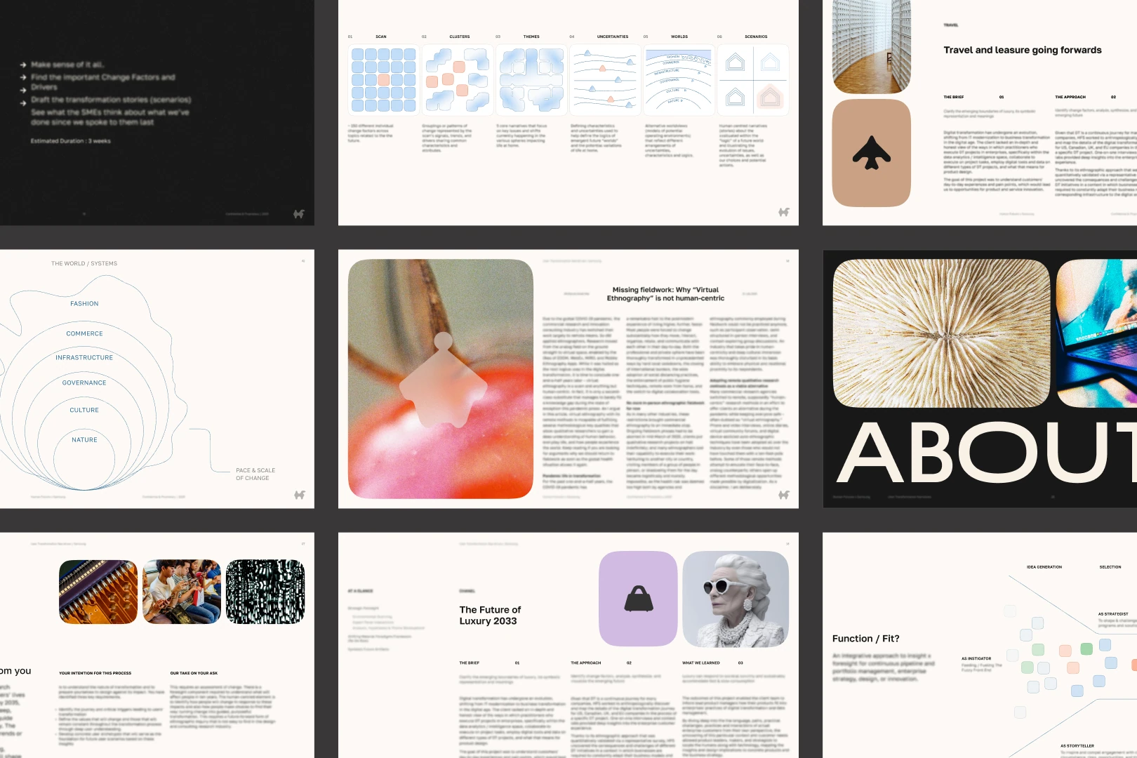
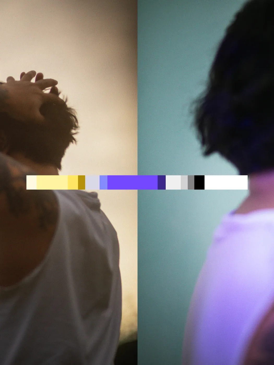
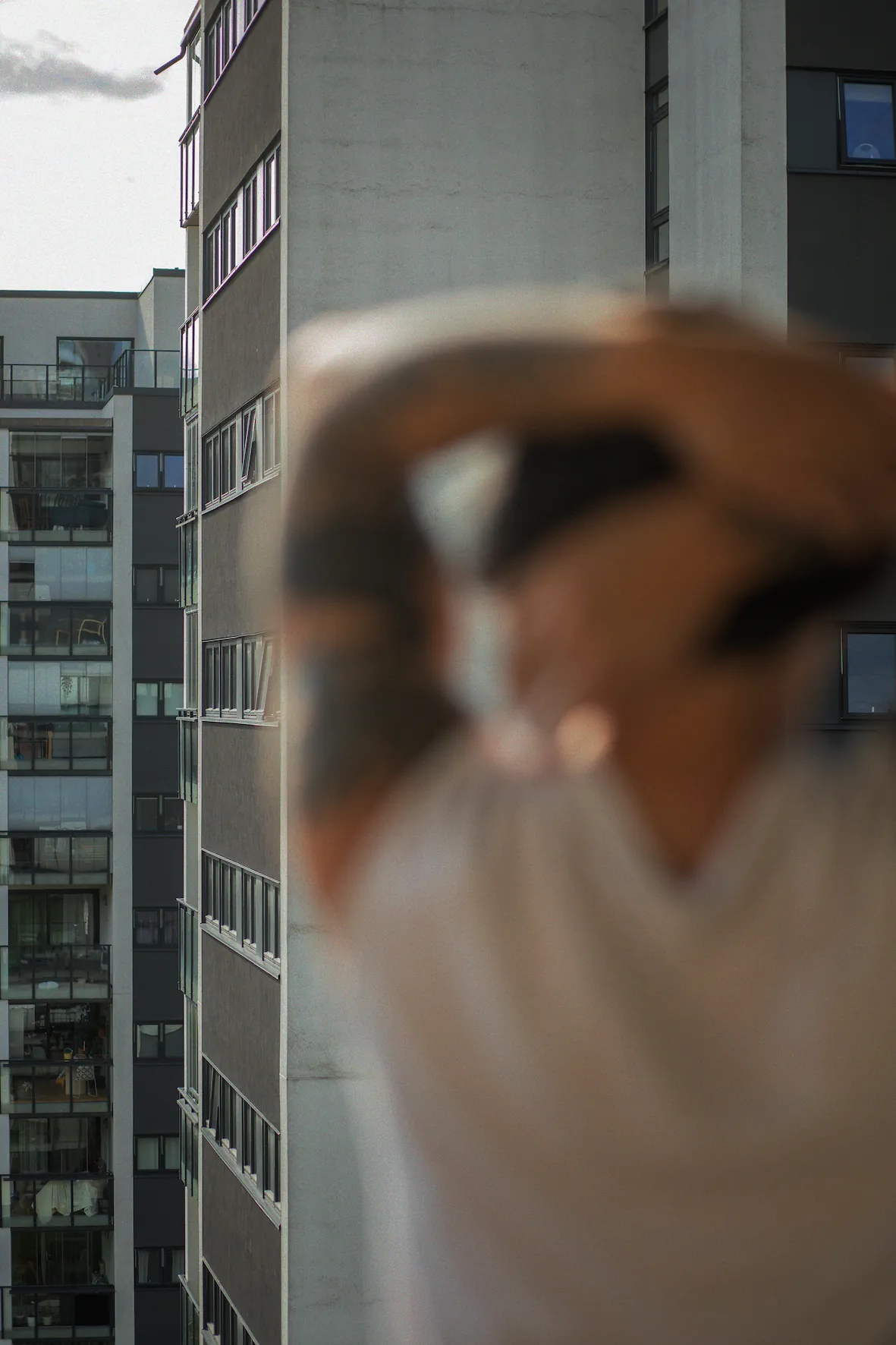
In partnership with Lazy Sundays, I contributed to a brand evolution for Human Futures, helping them break free from the stereotypical consultancy mold.
Human Futures
HUMAN-CENTRIC FOCUS
Services
Brand strategy
Web design
Visual identity
About
In partnership with Lazy Sundays, I contributed to a brand evolution for Human Futures, helping them break free from the stereotypical consultancy mold.
Human Futures
HUMAN-CENTRIC FOCUS
Services
Brand strategy
Web design
Visual identity
About
In partnership with Lazy Sundays, I contributed to a brand evolution for Human Futures, helping them break free from the stereotypical consultancy mold.
Human Futures
HUMAN-CENTRIC FOCUS
Services
Brand strategy
Web design
Visual identity
About
In partnership with Lazy Sundays, I contributed to a brand evolution for Human Futures, helping them break free from the stereotypical consultancy mold.
Human Futures
HUMAN-CENTRIC FOCUS
Services
Brand strategy
Web design
Visual identity


About
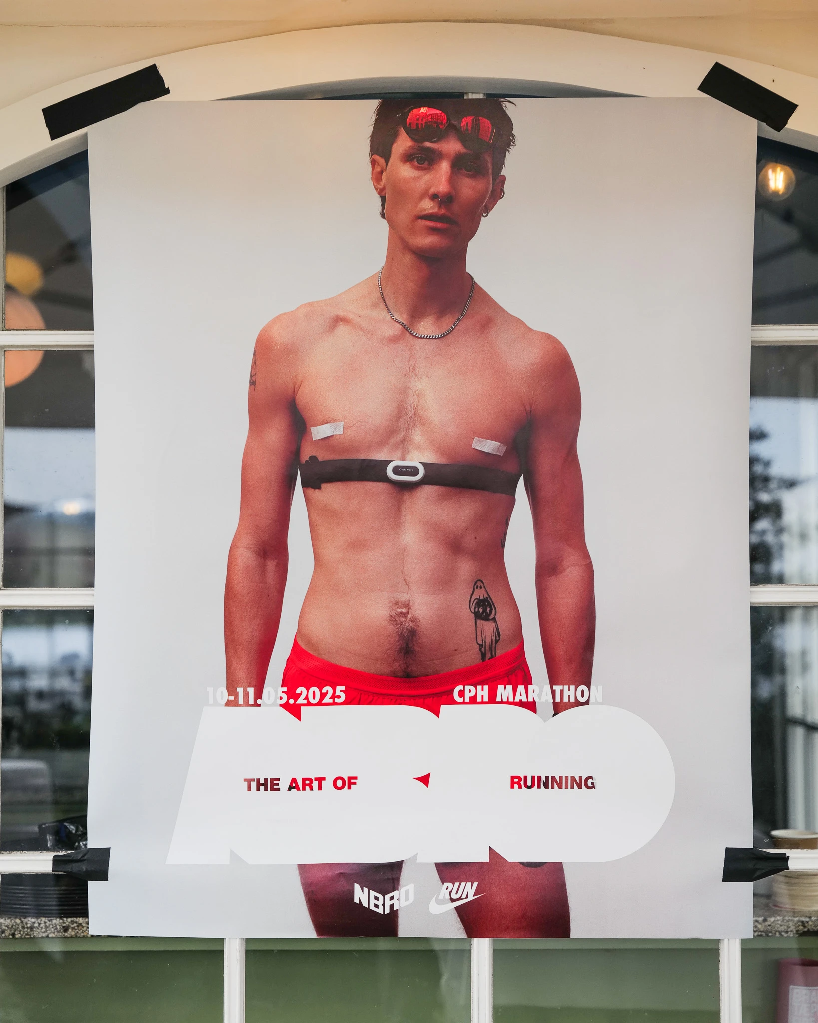
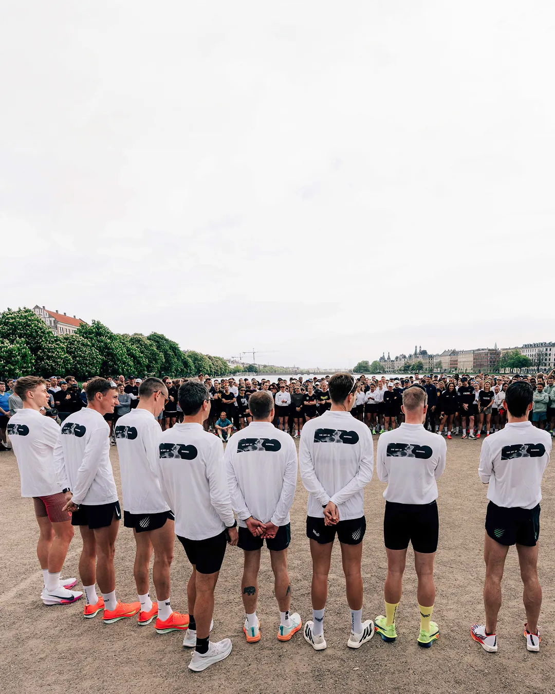
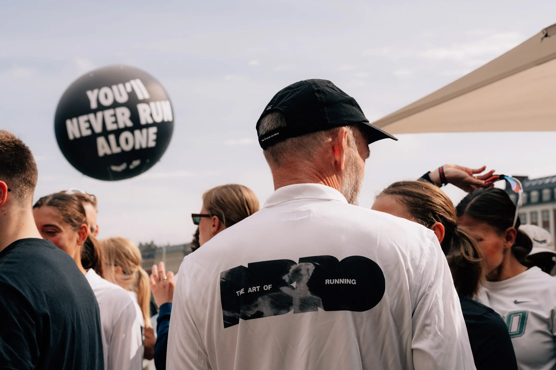
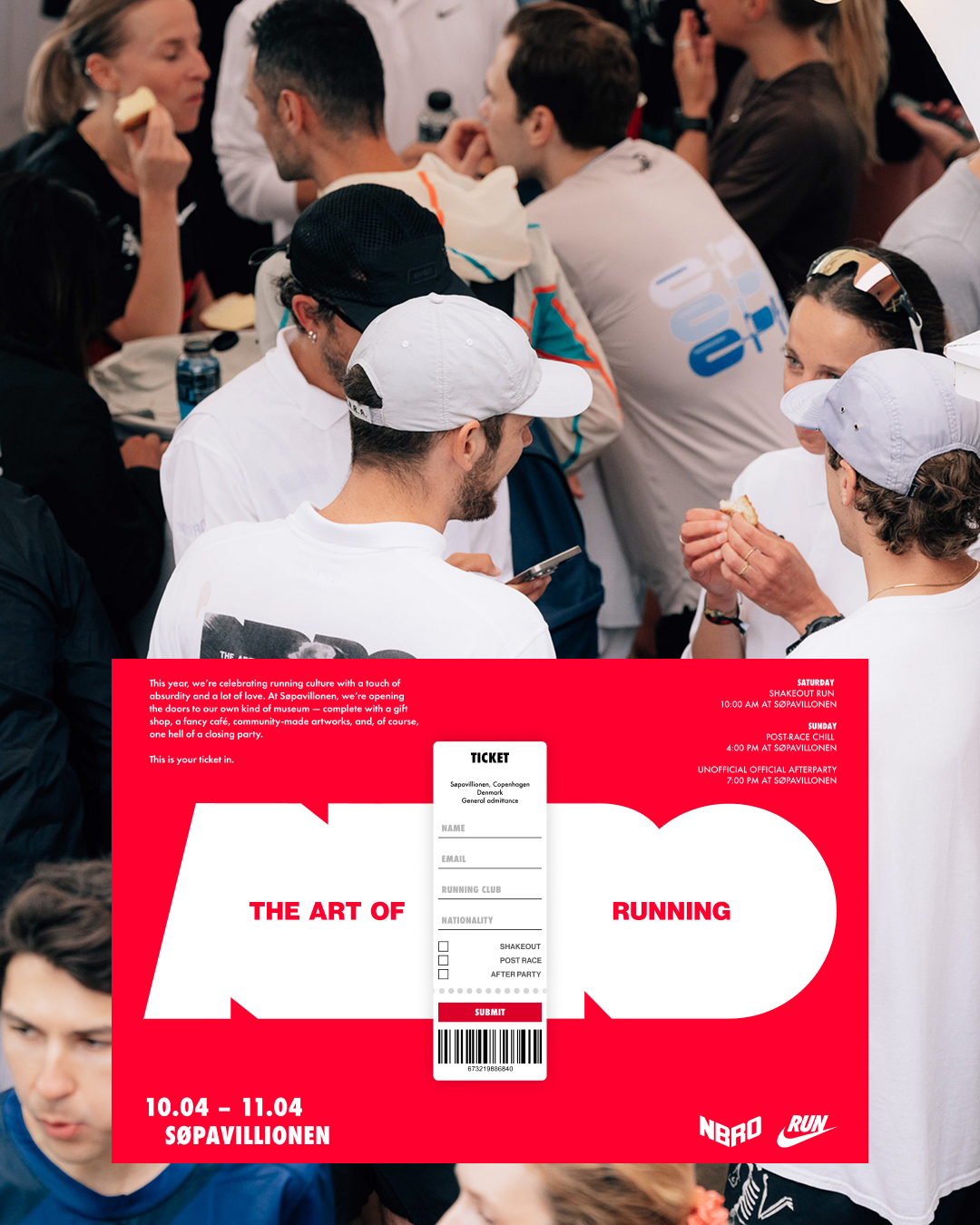
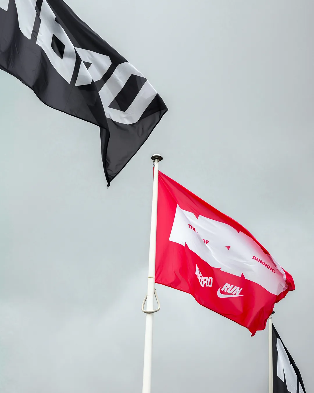
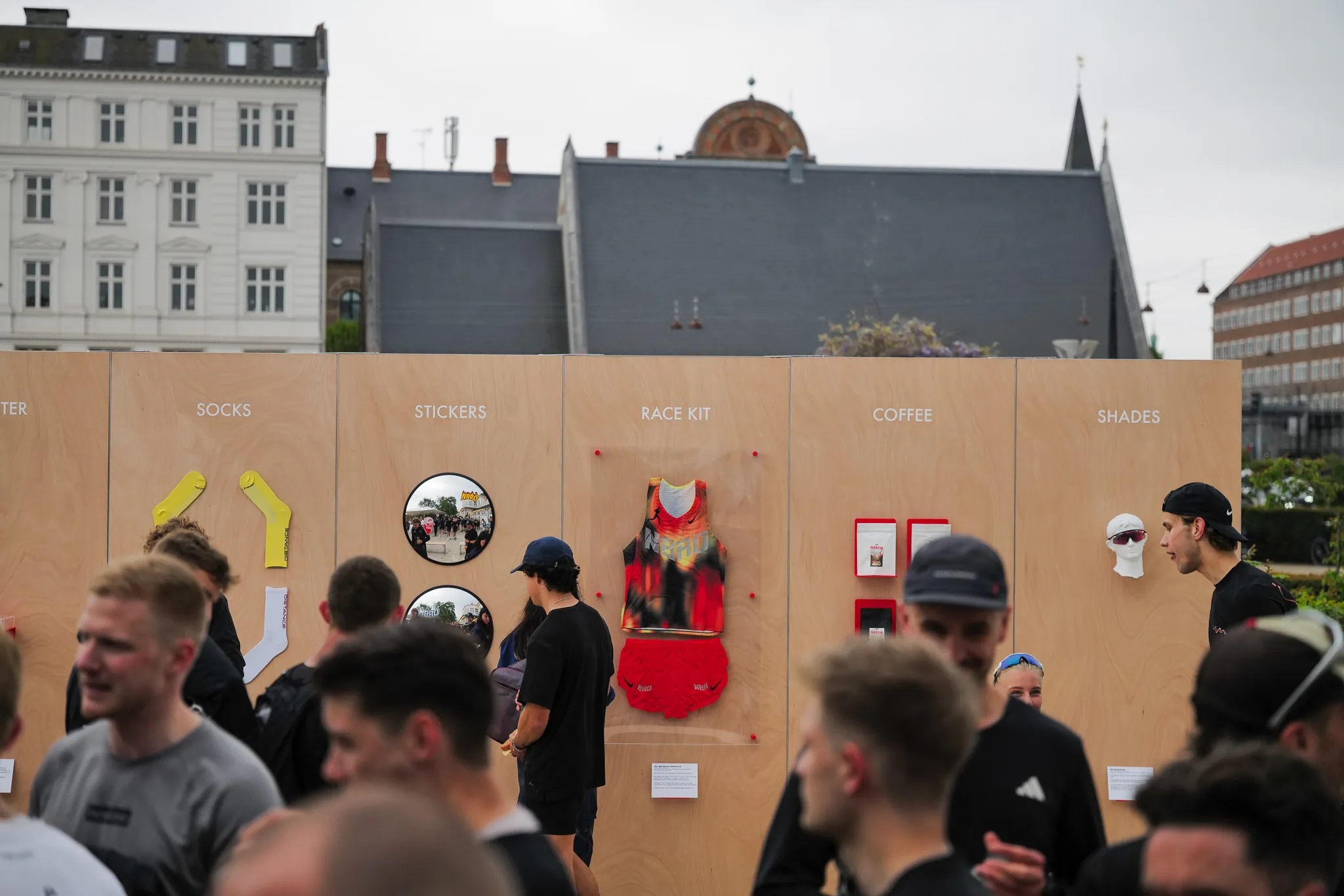
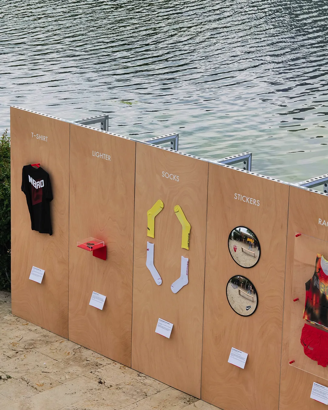
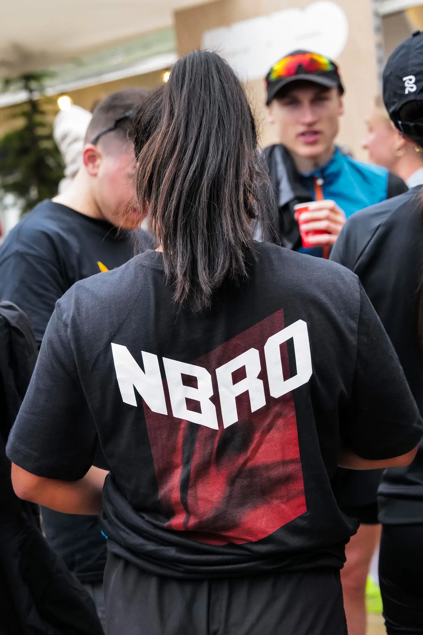
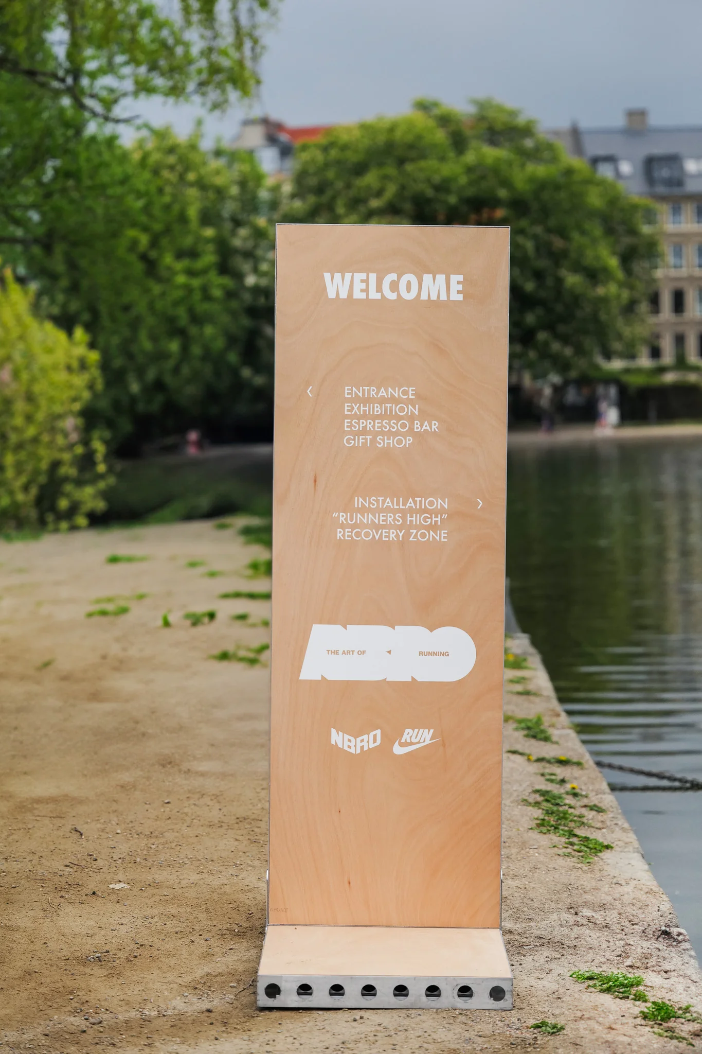
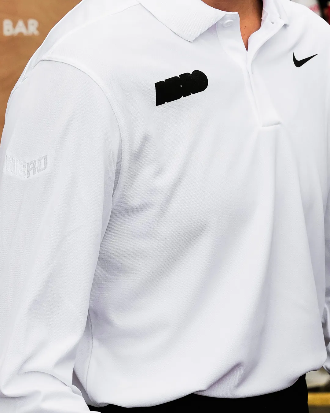
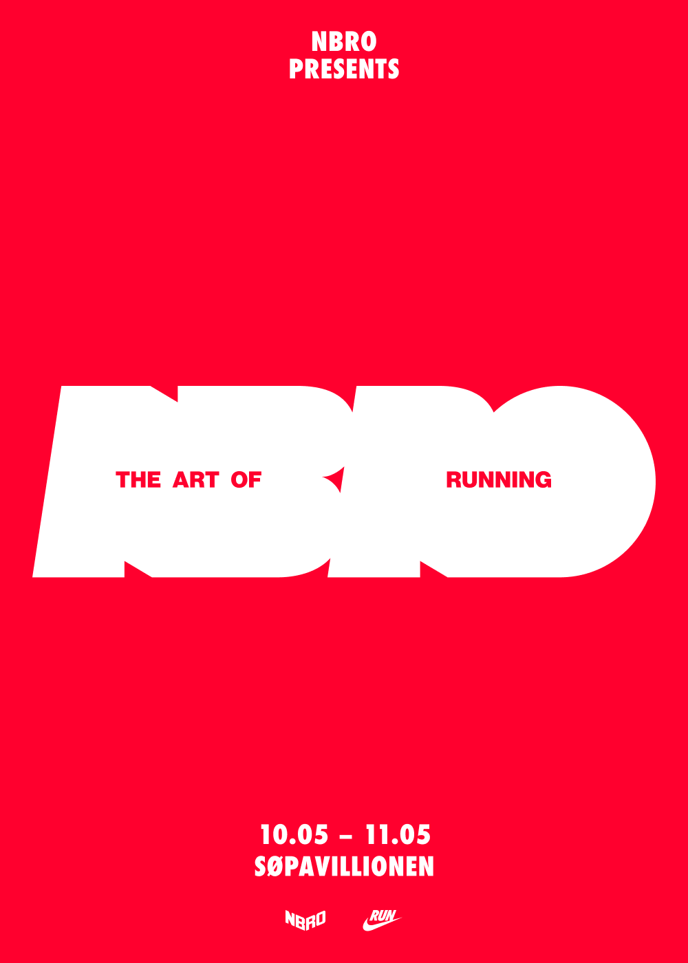
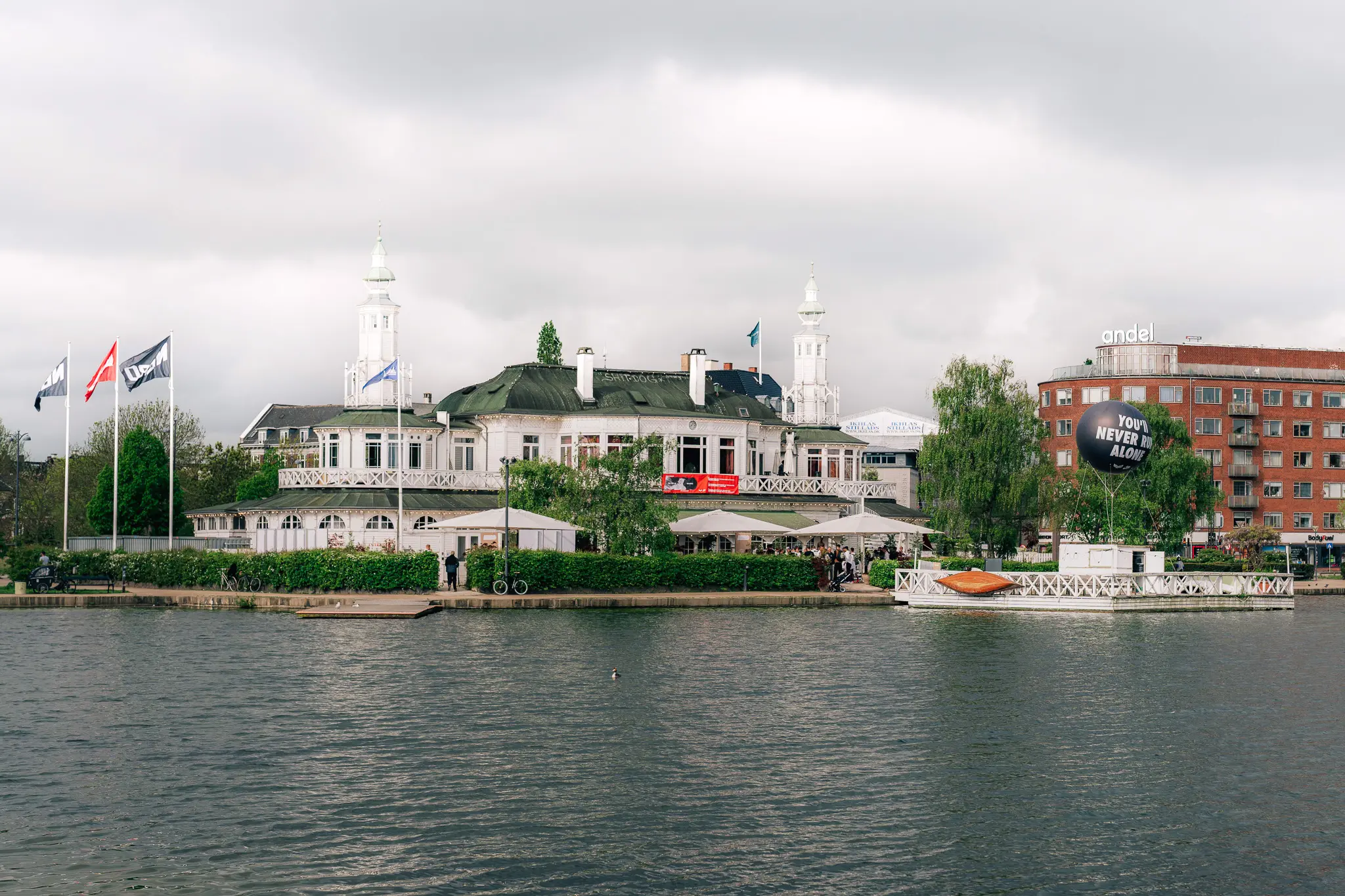
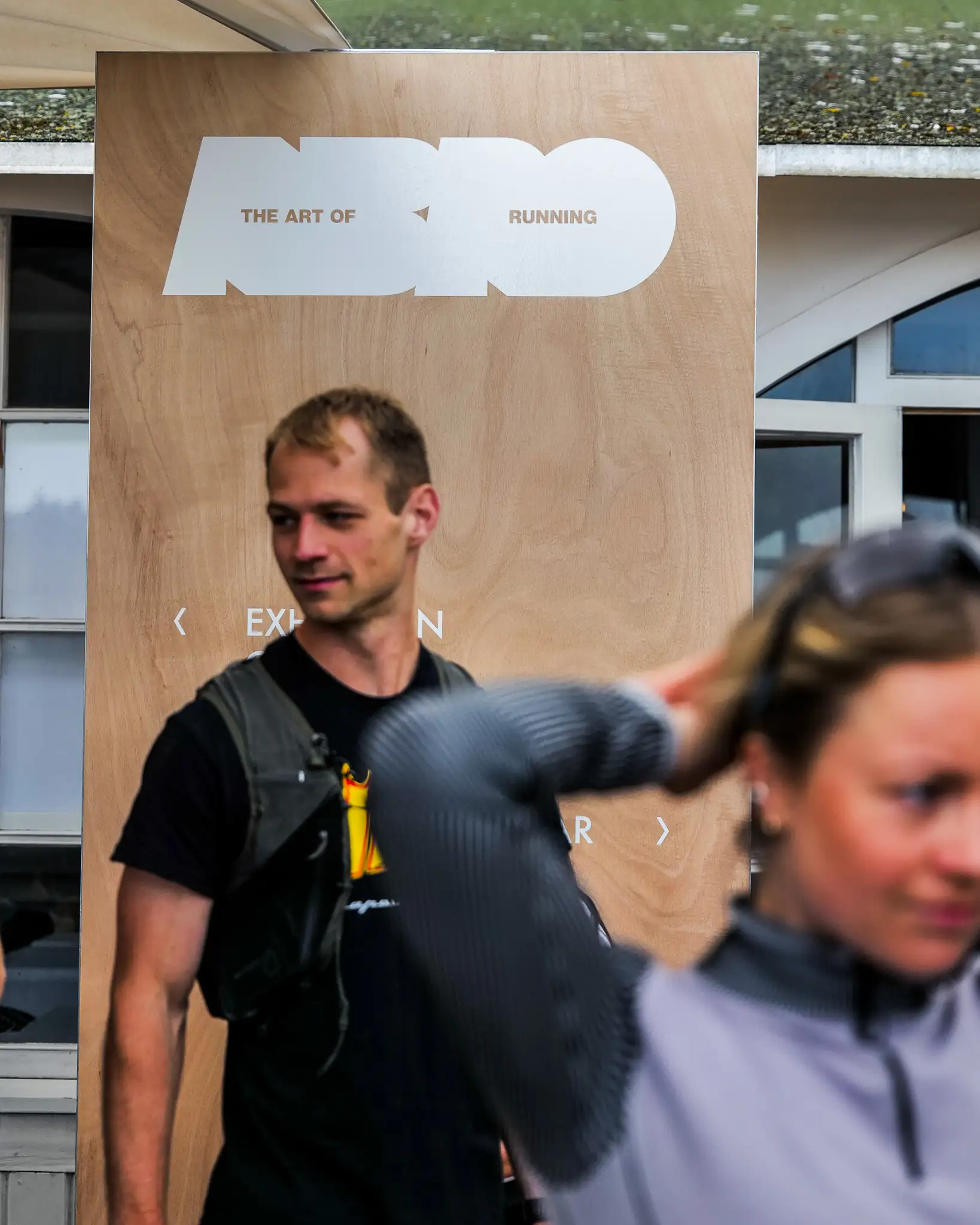
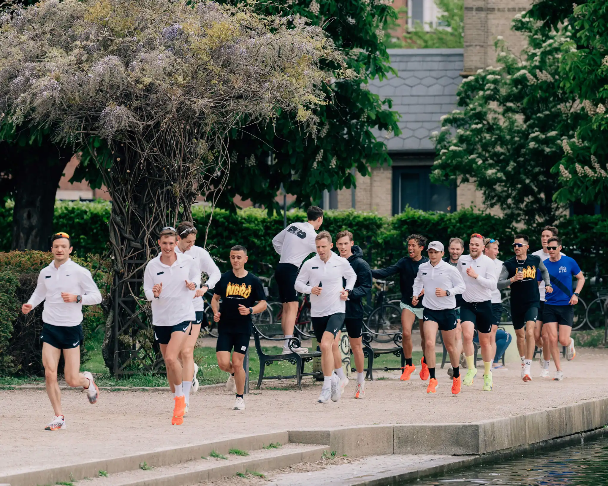
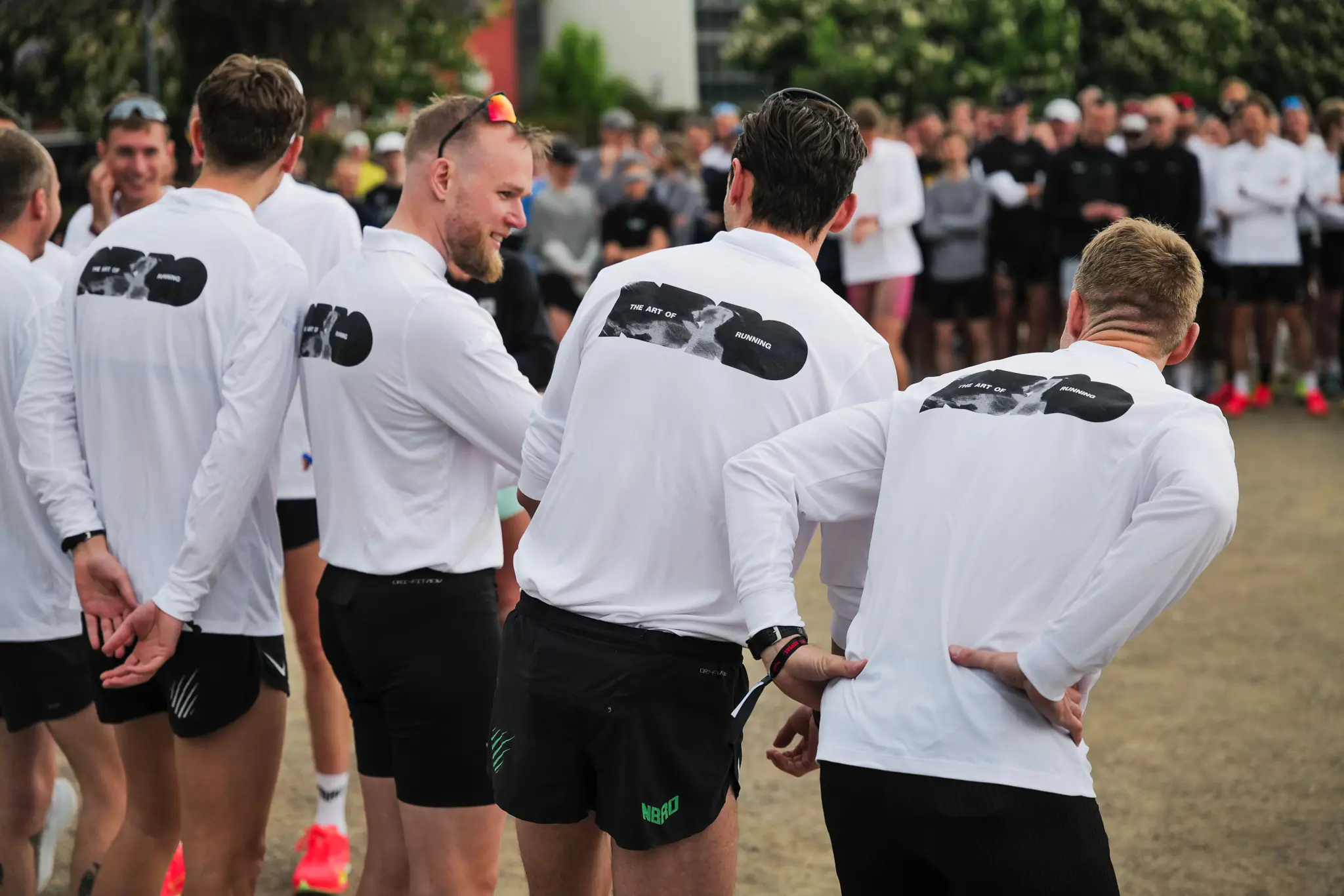
Developed in collaboration NBRO and Nike, Copenhagen's most infamous running club, a pop-up blending contemporary art with the spirit of running.
Providing
NBRO X Nike
RUN TO THE GALLERY
Services
Web design
Visual identity
About
Developed in collaboration NBRO and Nike, Copenhagen's most infamous running club, a pop-up blending contemporary art with the spirit of running.
Providing
NBRO X Nike
RUN TO THE GALLERY
Services
Web design
Visual identity
About
Developed in collaboration NBRO and Nike, Copenhagen's most infamous running club, a pop-up blending contemporary art with the spirit of running.
Providing
NBRO X Nike
RUN TO THE GALLERY
Services
Web design
Visual identity
About
Developed in collaboration NBRO and Nike, Copenhagen's most infamous running club, a pop-up blending contemporary art with the spirit of running.
Providing
NBRO X Nike
RUN TO THE GALLERY
Services
Web design
Visual identity
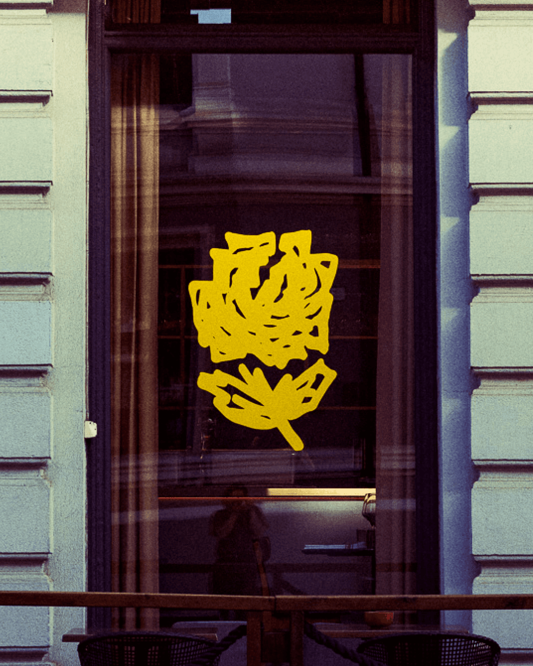
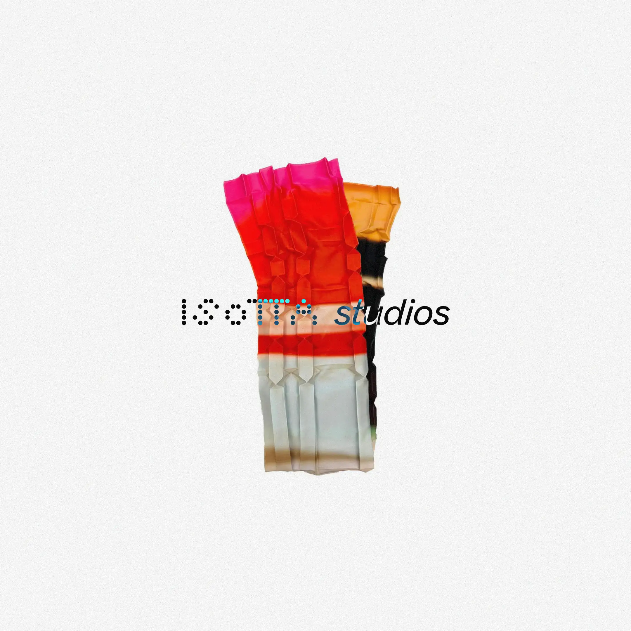
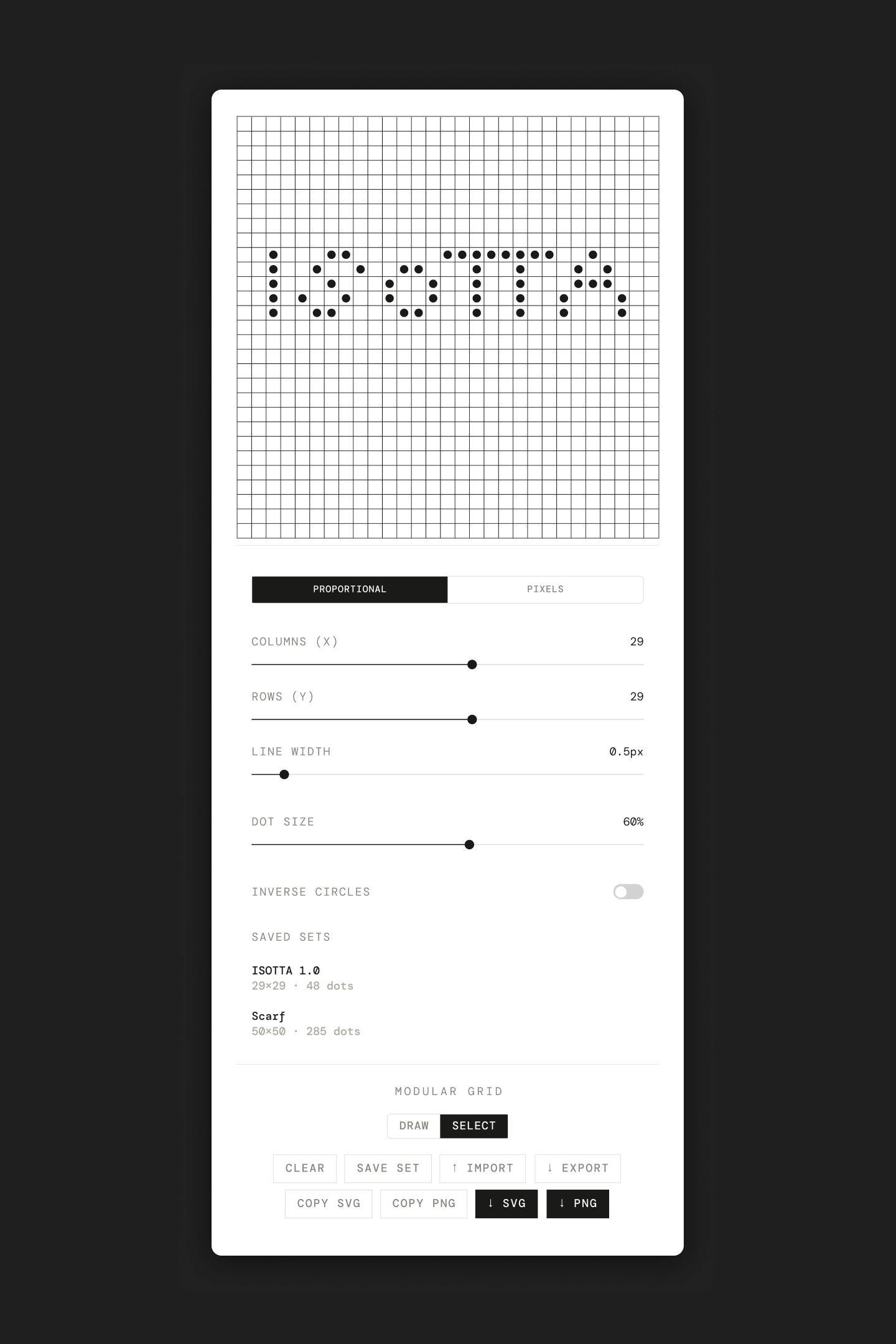
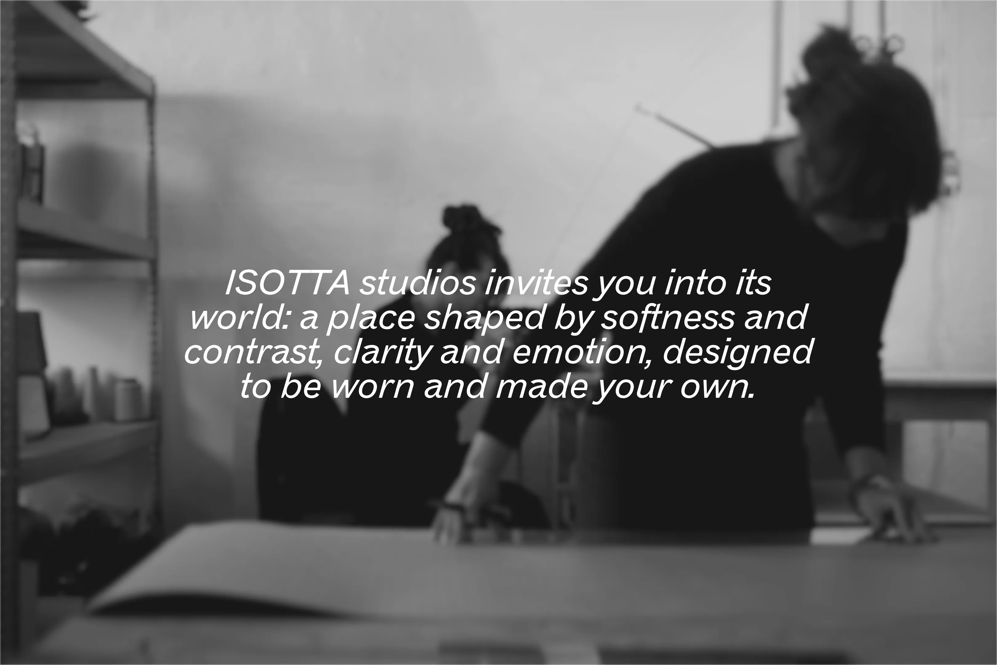
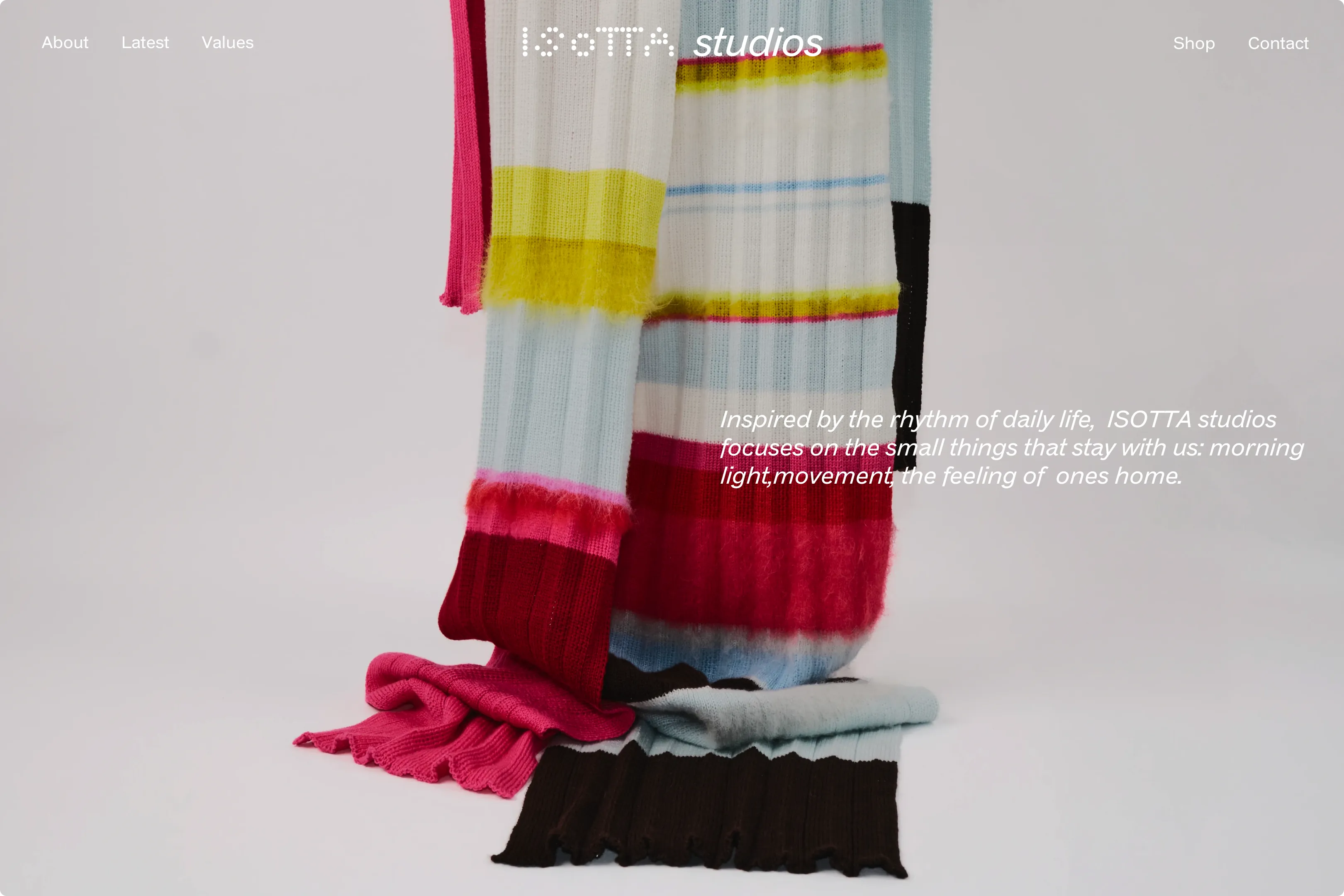
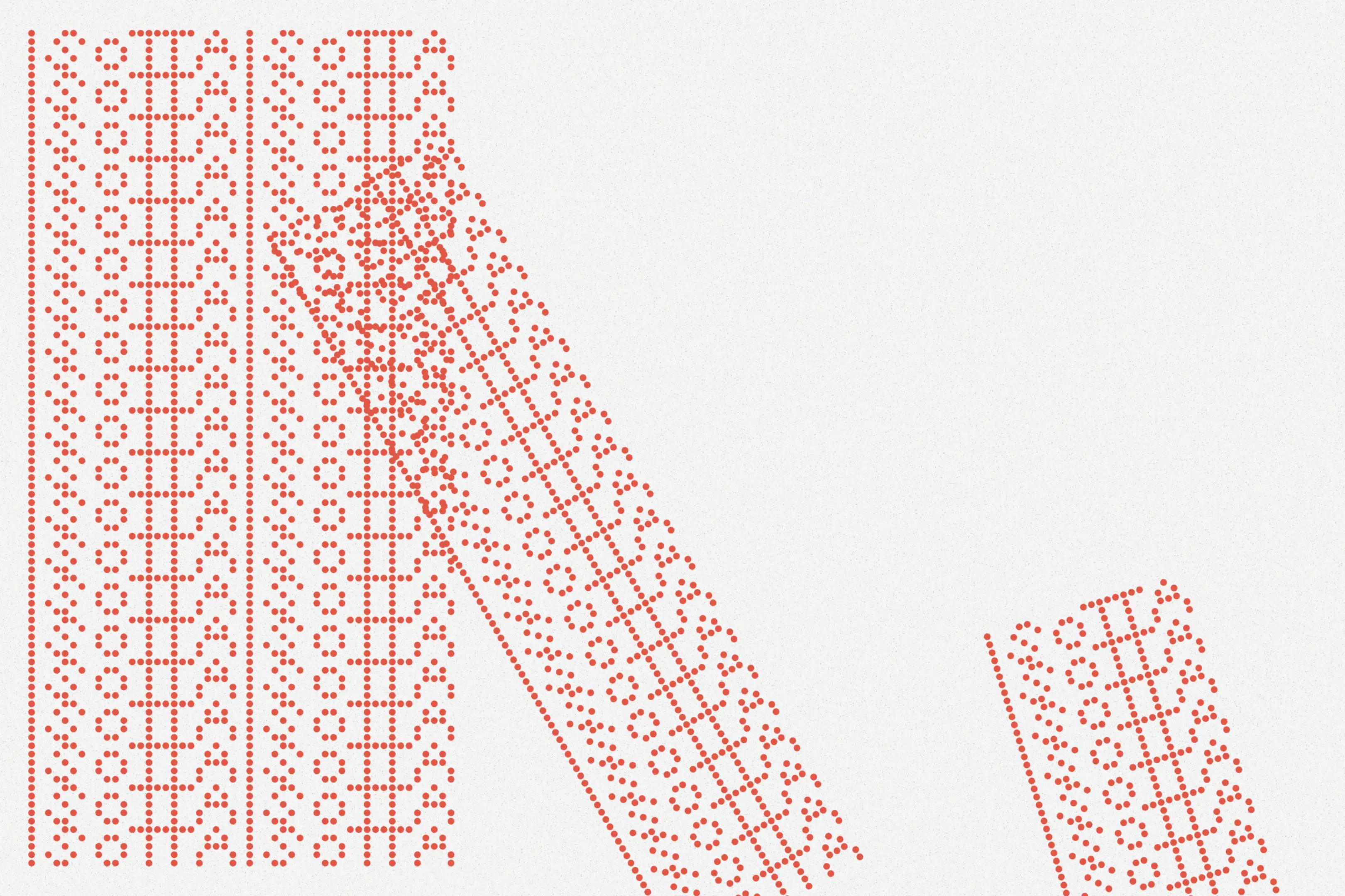
About
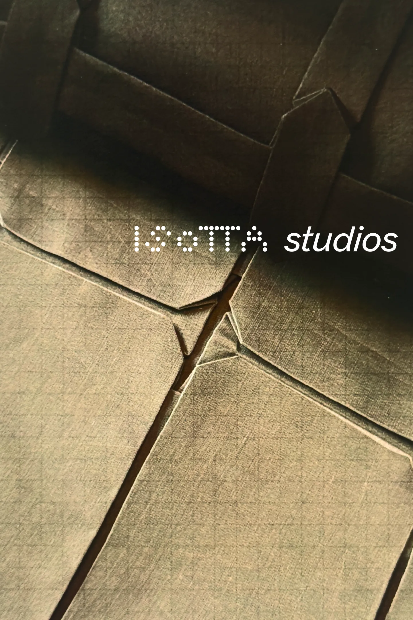
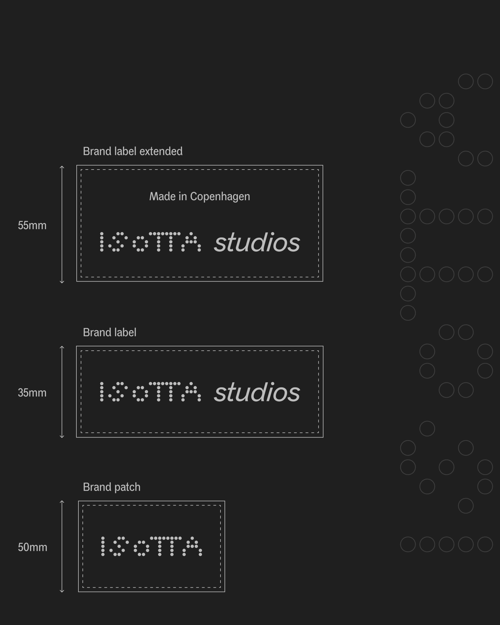
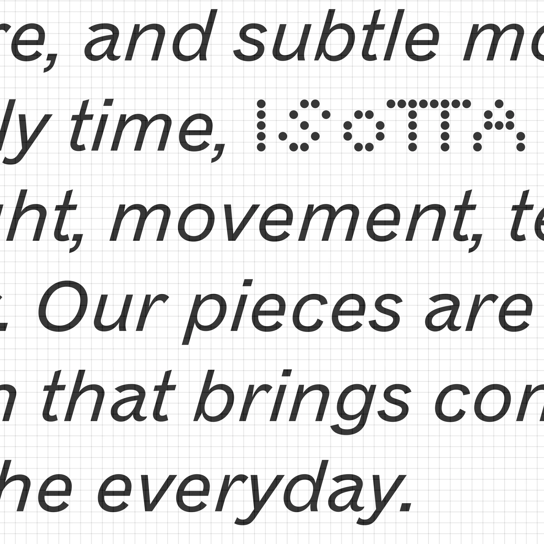
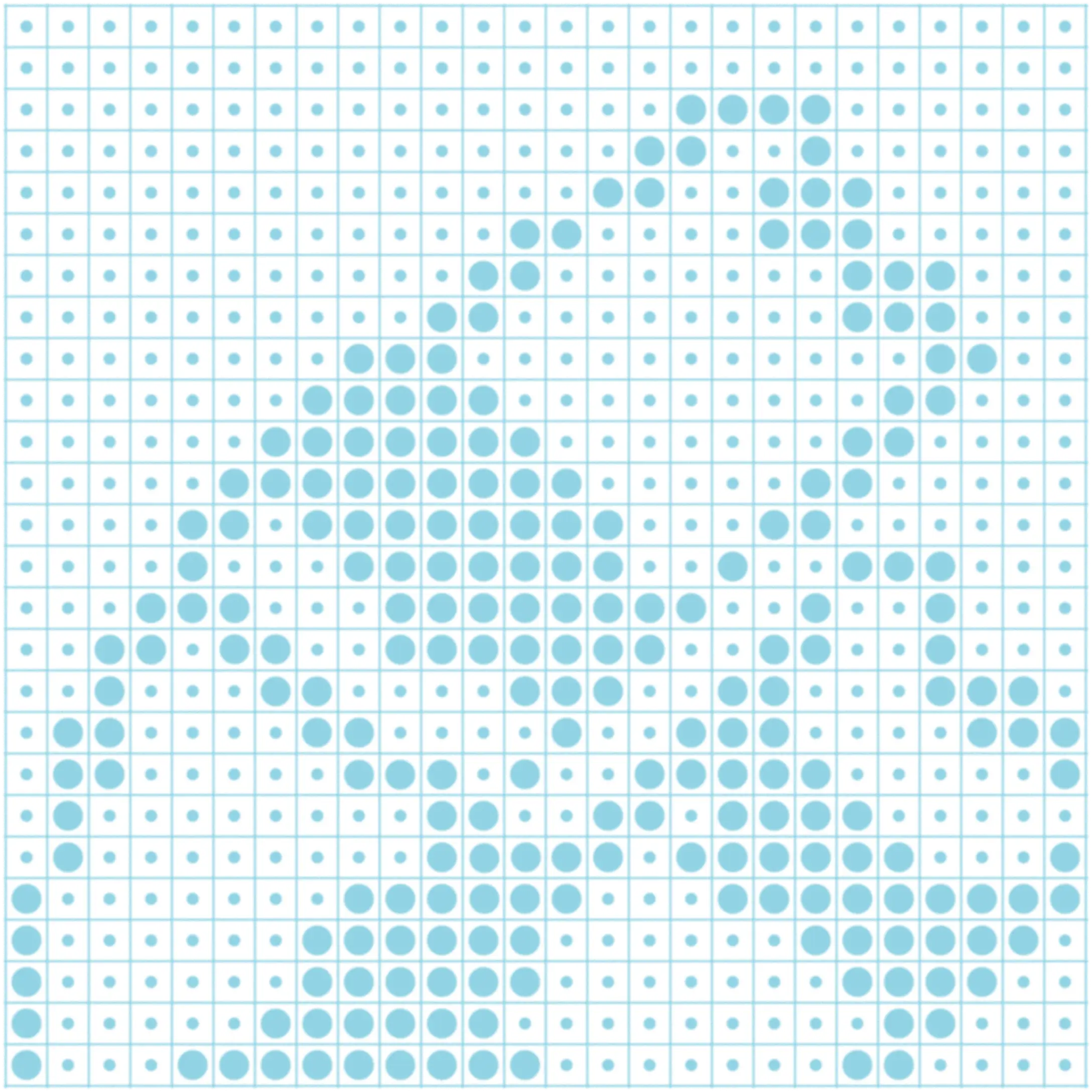
ISOTTA studios strives to create pieces that envokes an emotional connection to the wearer.
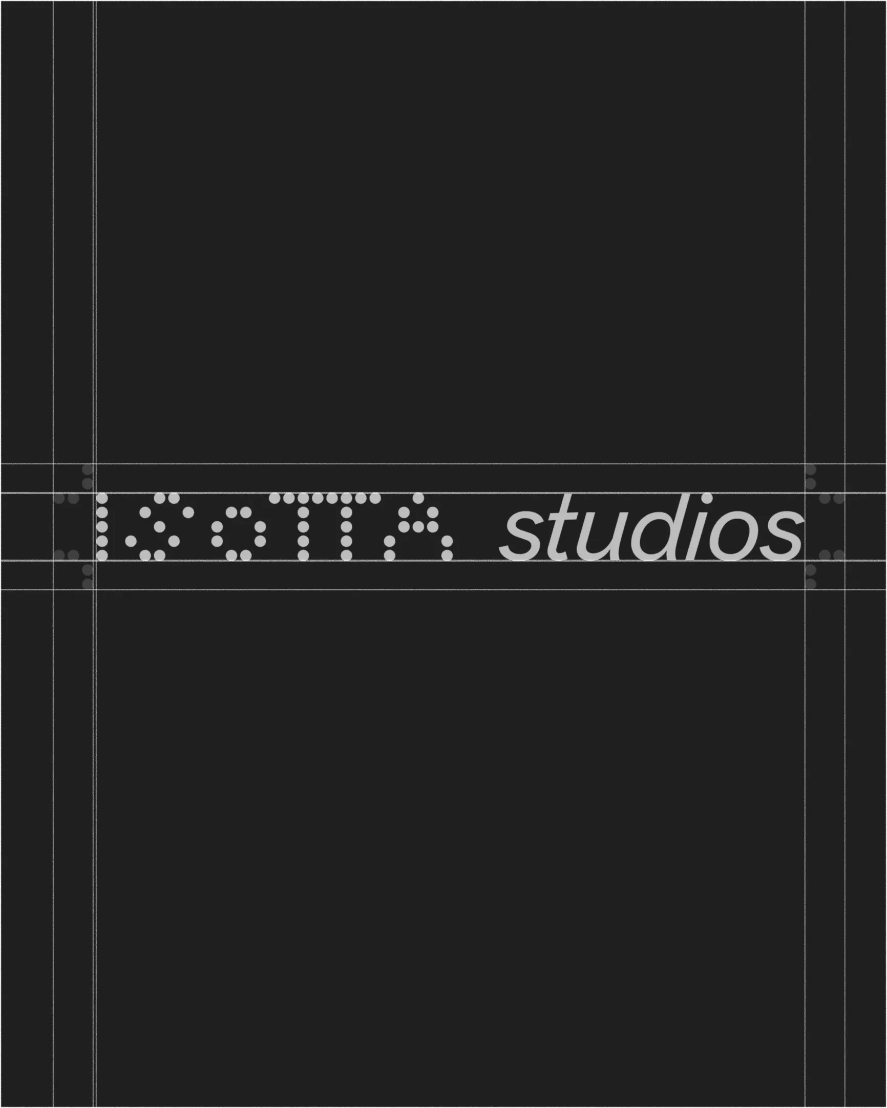
ISOTTA studios
THOUGHTFUL TACTILITY
Services
Visual identity
Visual identity
About
ISOTTA studios strives to create pieces that envokes an emotional connection to the wearer.
ISOTTA studios
THOUGHTFUL TACTILITY
Services
Visual identity
Visual identity
About
ISOTTA studios strives to create pieces that envokes an emotional connection to the wearer.
ISOTTA studios
THOUGHTFUL TACTILITY
Services
Visual identity
Visual identity
About
ISOTTA studios strives to create pieces that envokes an emotional connection to the wearer.
ISOTTA studios
THOUGHTFUL TACTILITY
Services
Visual identity
Visual identity

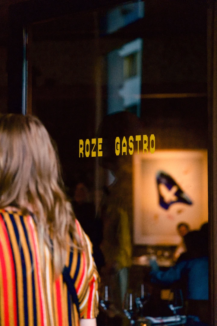
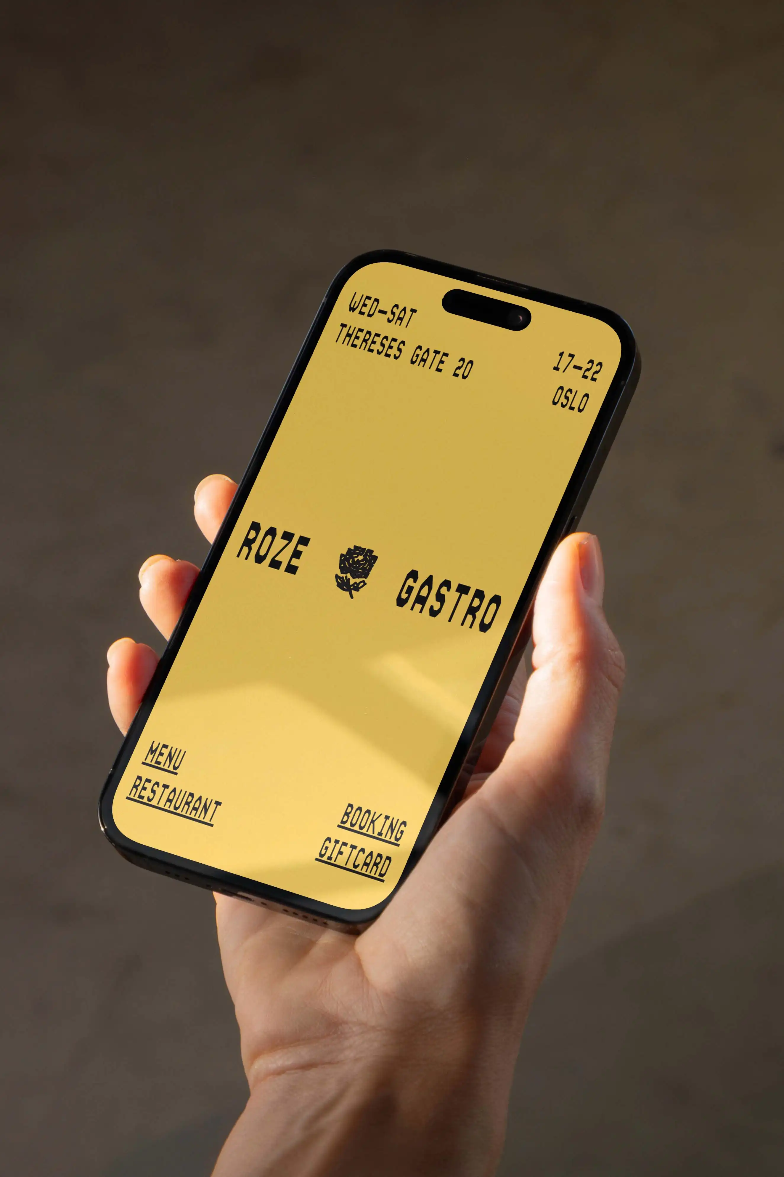
About
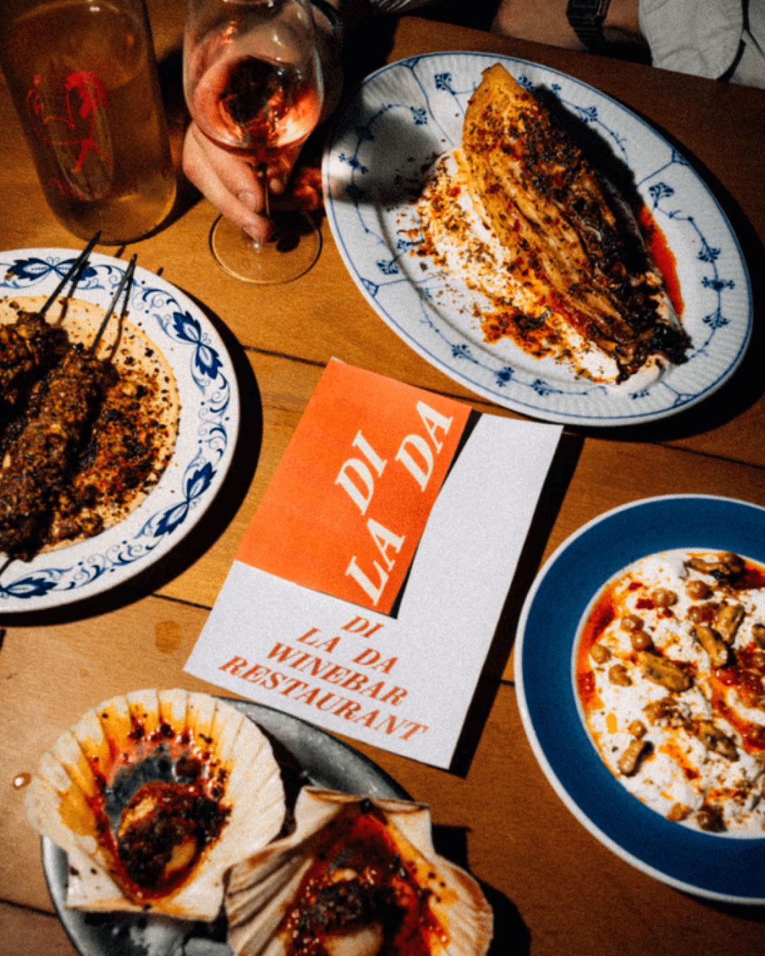
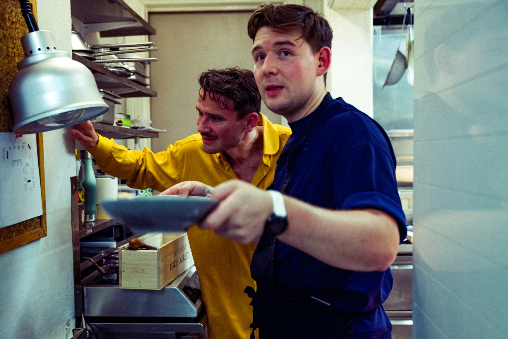
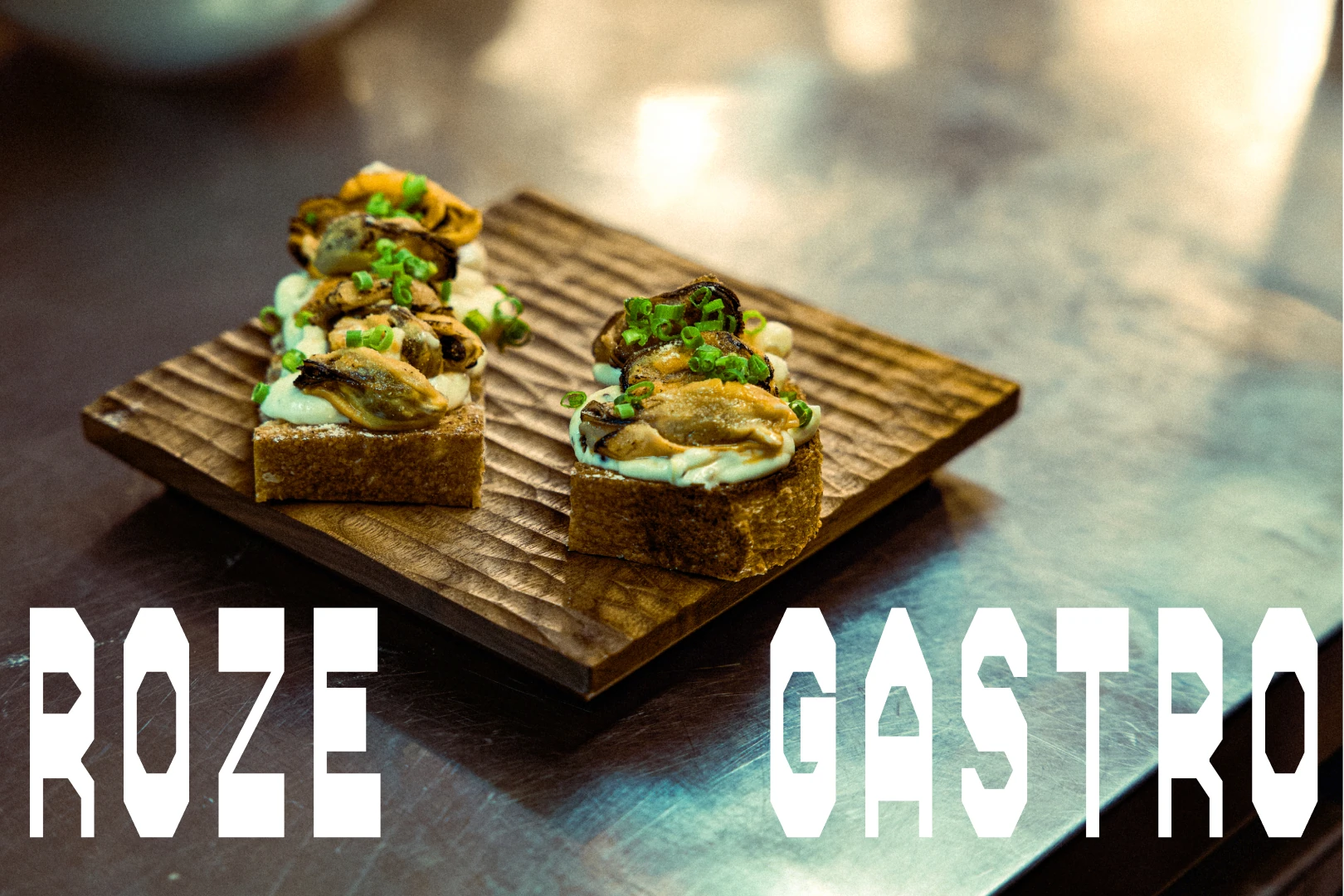
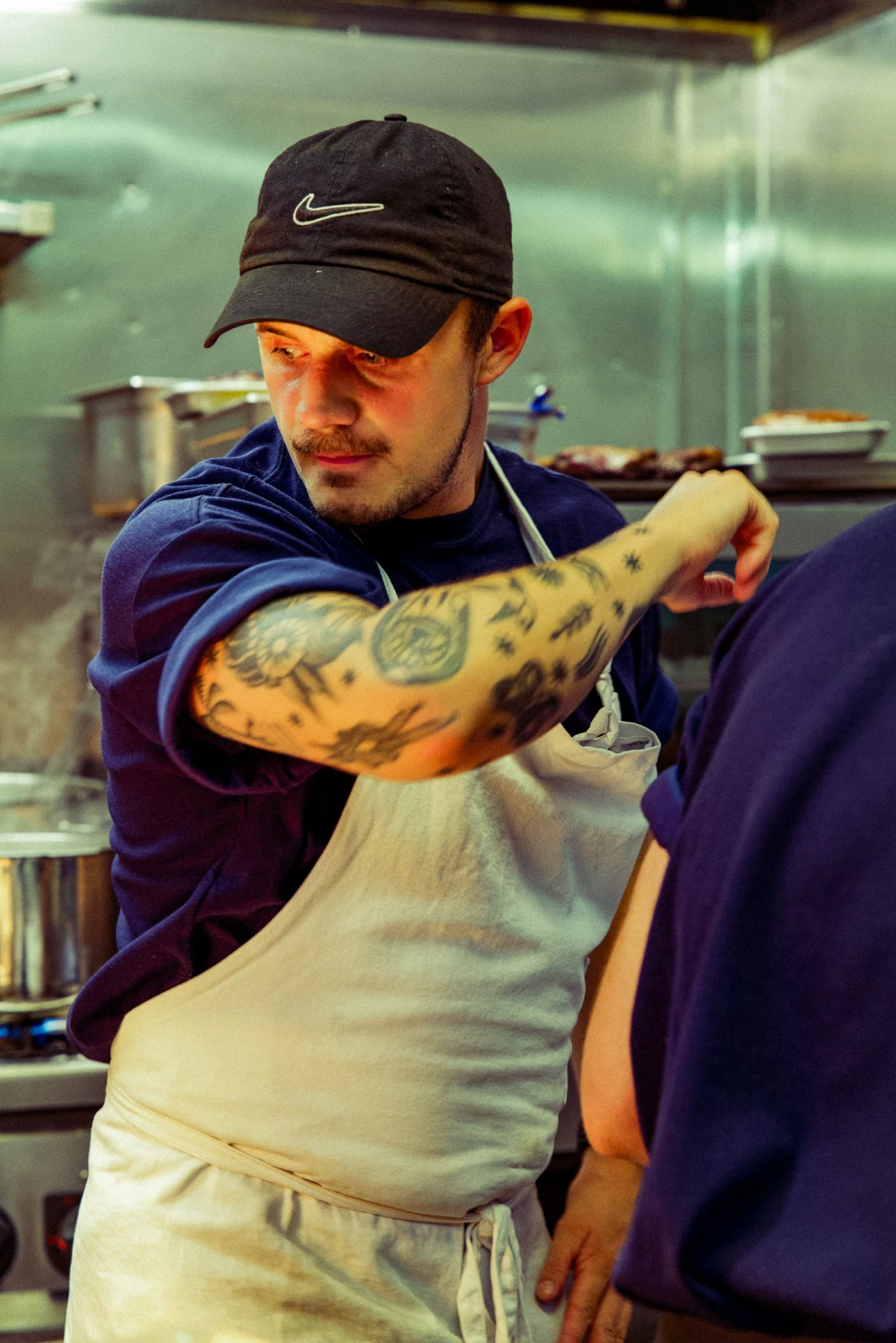
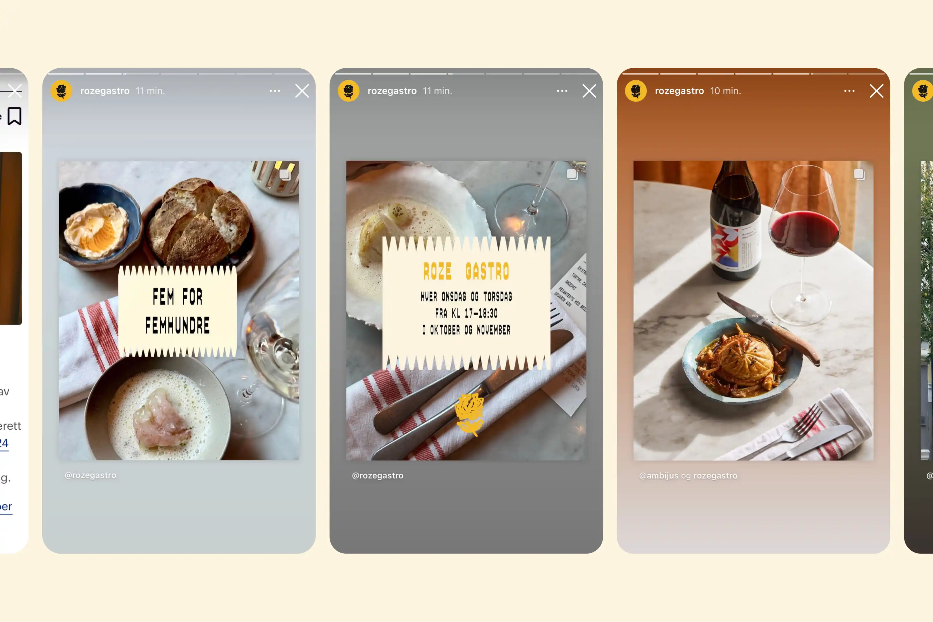
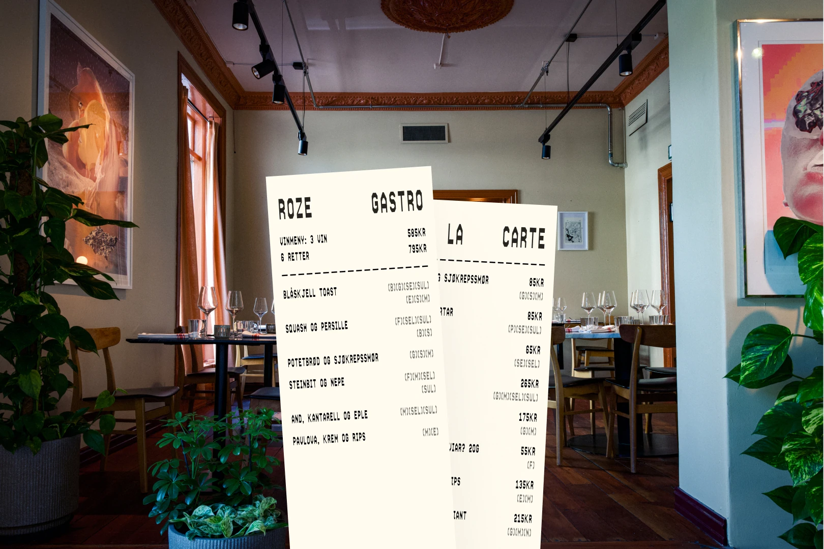
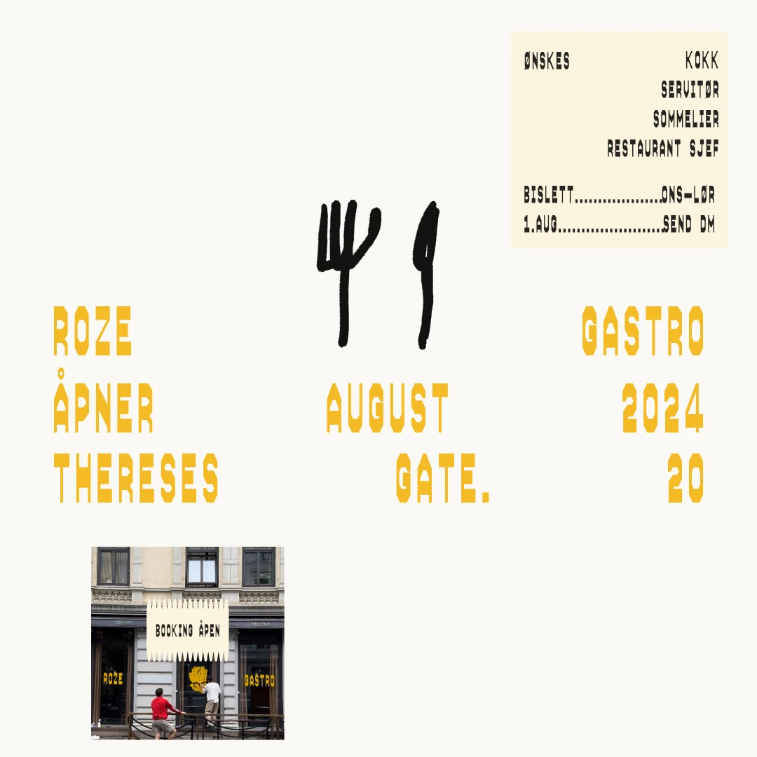
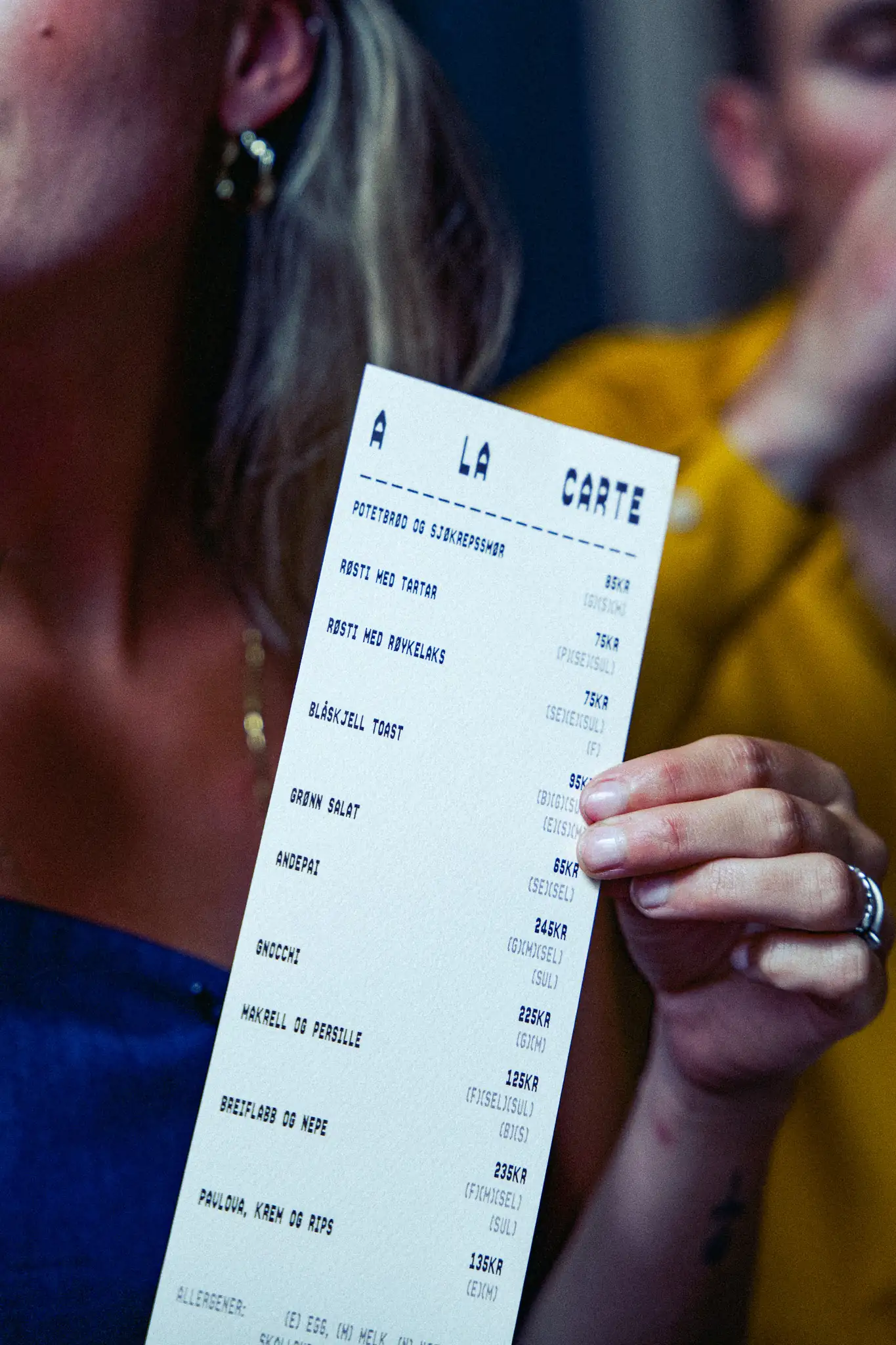
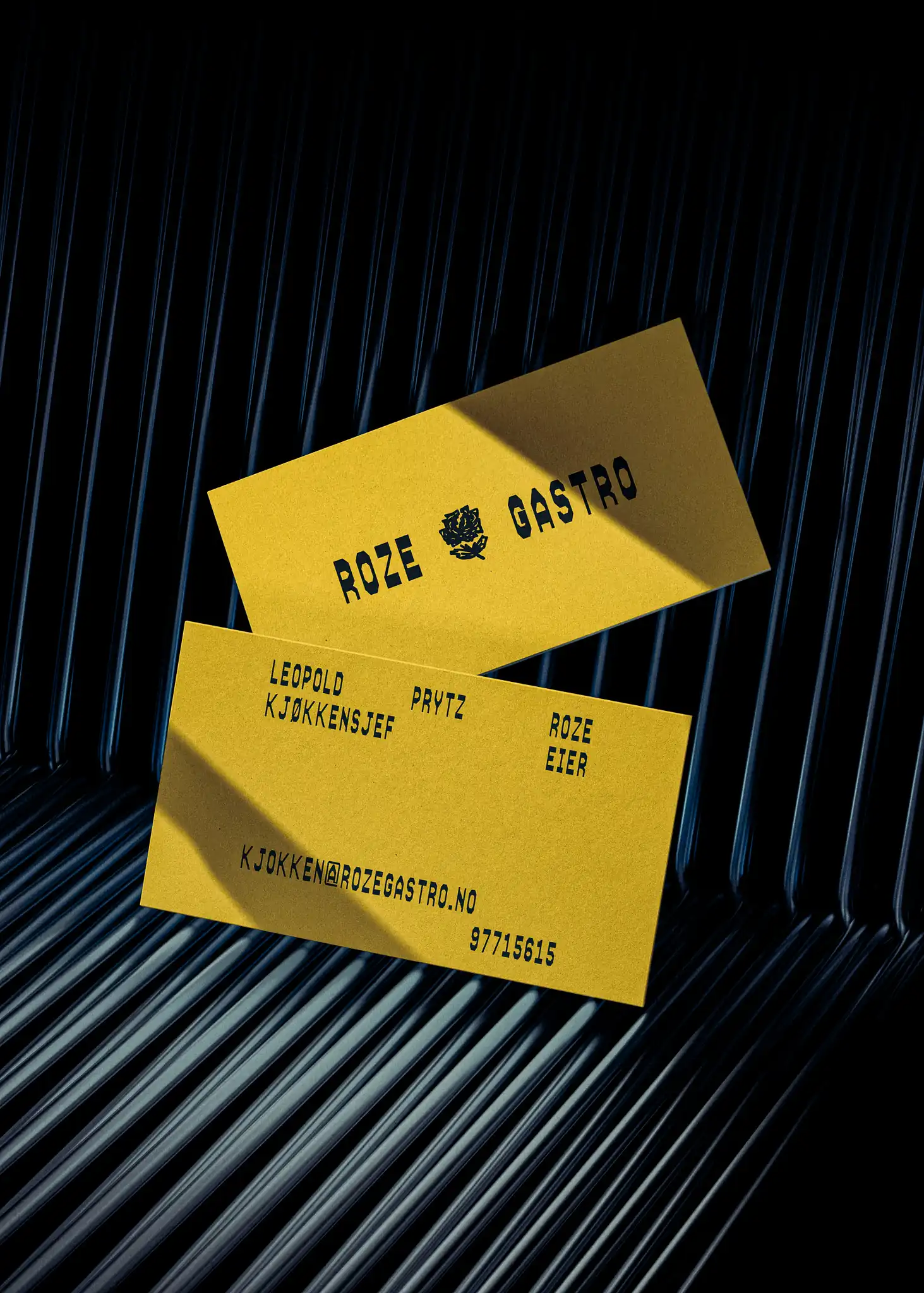
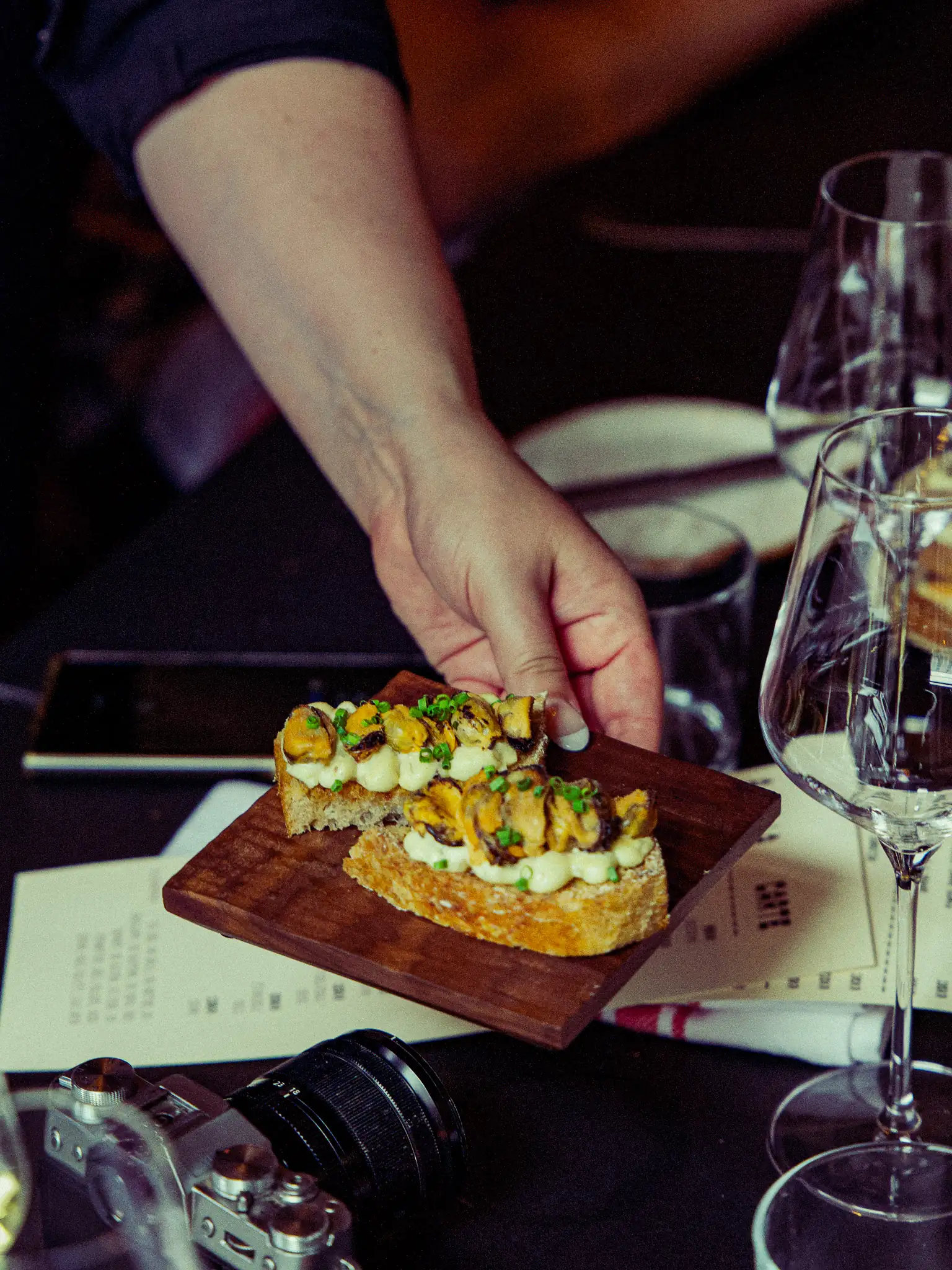
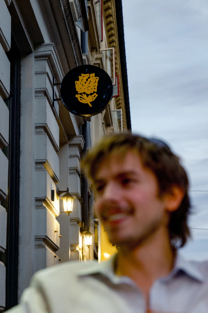
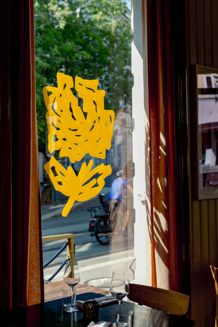
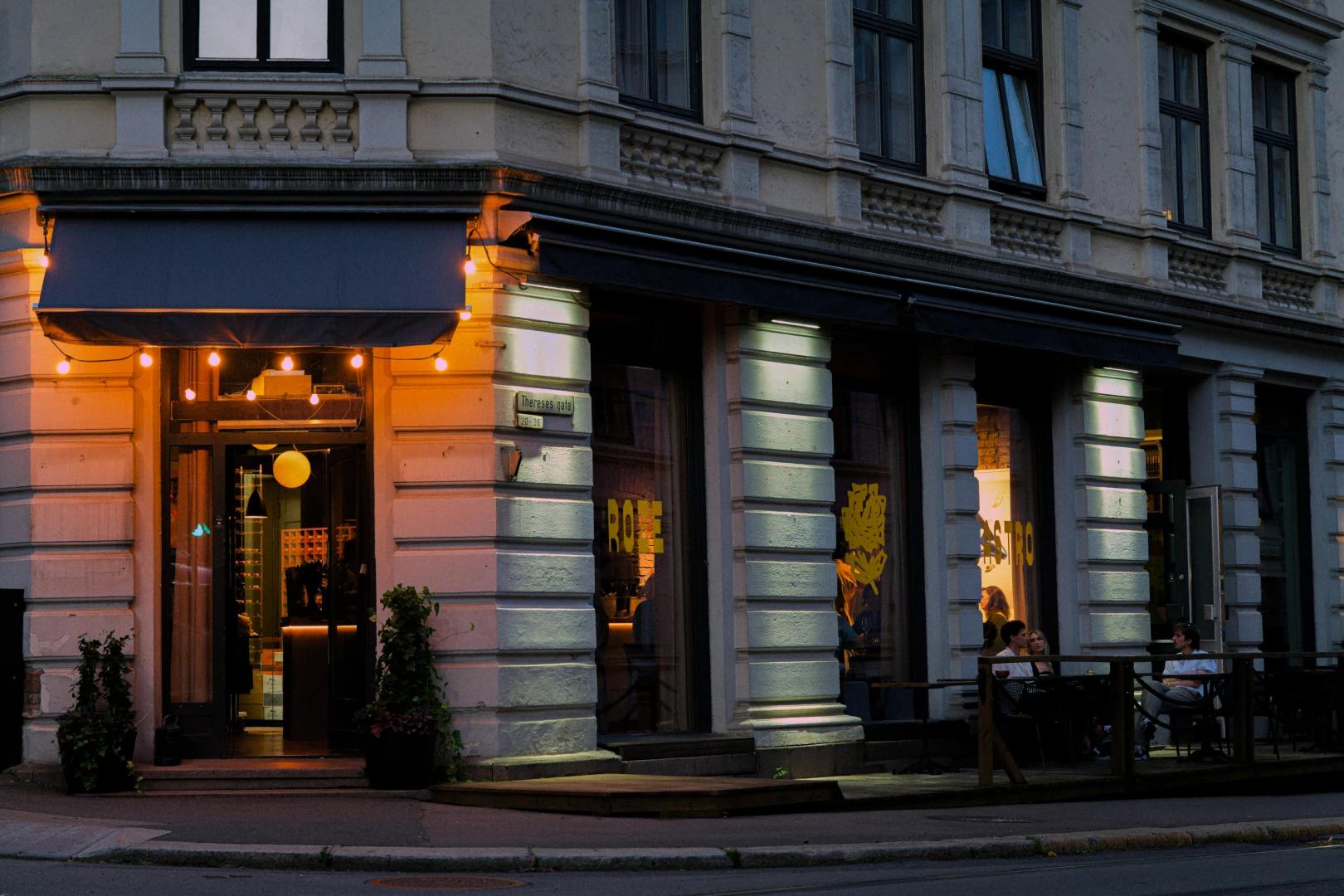
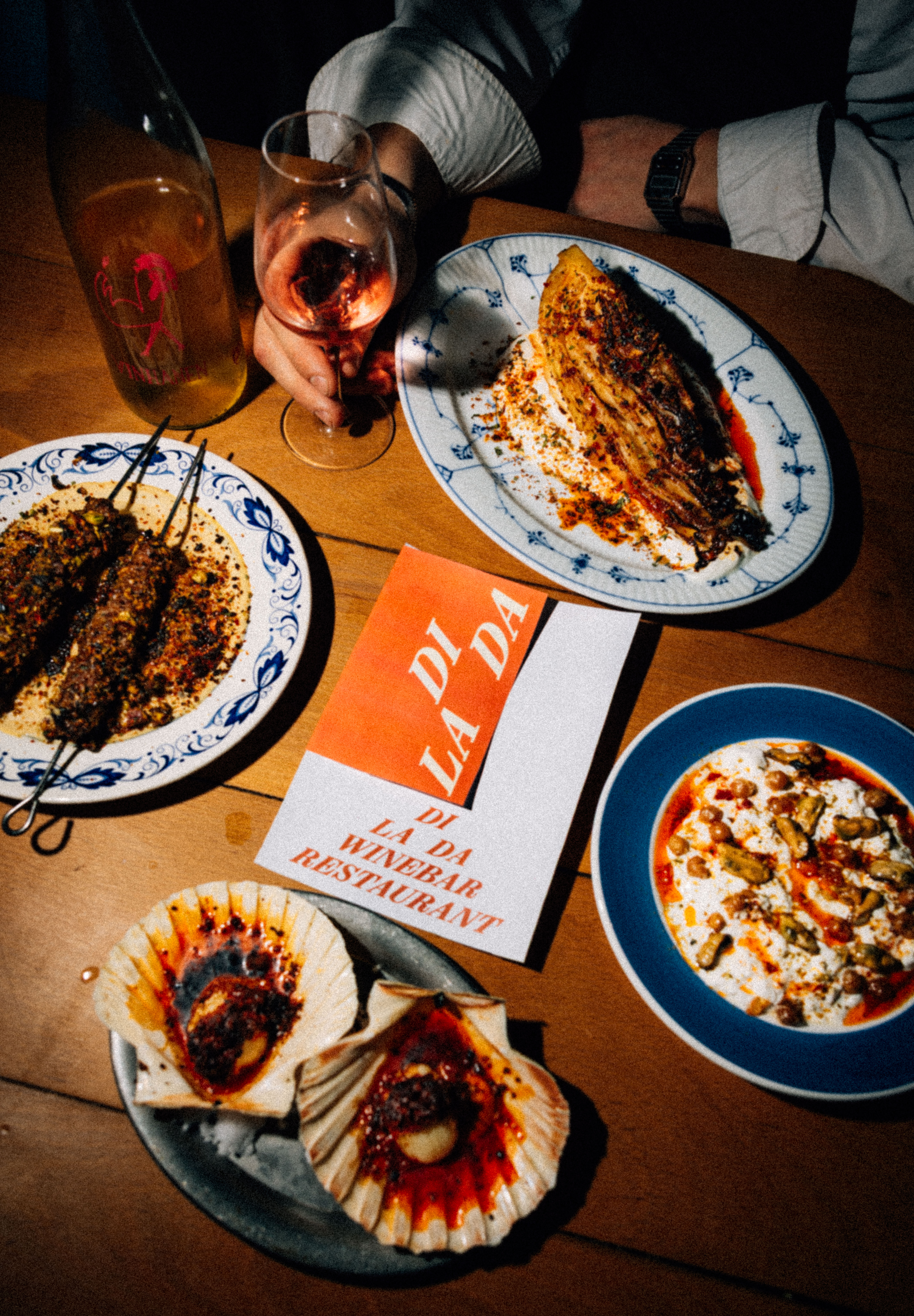
A new neighborhood restaurant in Oslo created by renowned chef, Leopold Roze.
Roze Gastro
CASUAL FINE DINING
Services
Brand strategy
Naming
Photography
Web design
Visual identity
Art Direction
About
A new neighborhood restaurant in Oslo created by renowned chef, Leopold Roze.
Roze Gastro
CASUAL FINE DINING
Services
Brand strategy
Naming
Photography
Web design
Visual identity
Art Direction
About
A new neighborhood restaurant in Oslo created by renowned chef, Leopold Roze.
Roze Gastro
CASUAL FINE DINING
Services
Brand strategy
Naming
Photography
Web design
Visual identity
Art Direction
About
A new neighborhood restaurant in Oslo created by renowned chef, Leopold Roze.
Roze Gastro
CASUAL FINE DINING
Services
Brand strategy
Naming
Photography
Web design
Visual identity
Art Direction


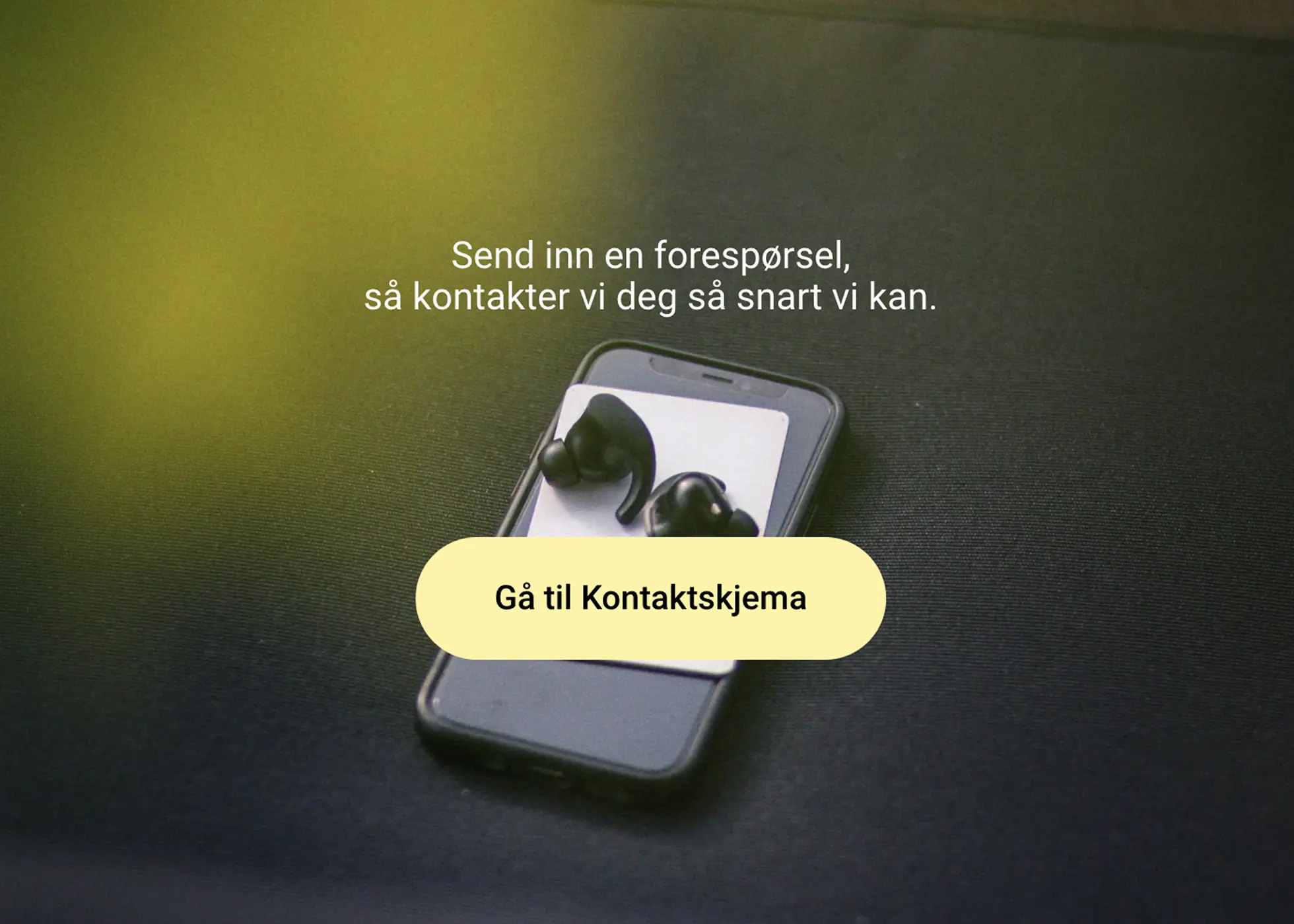
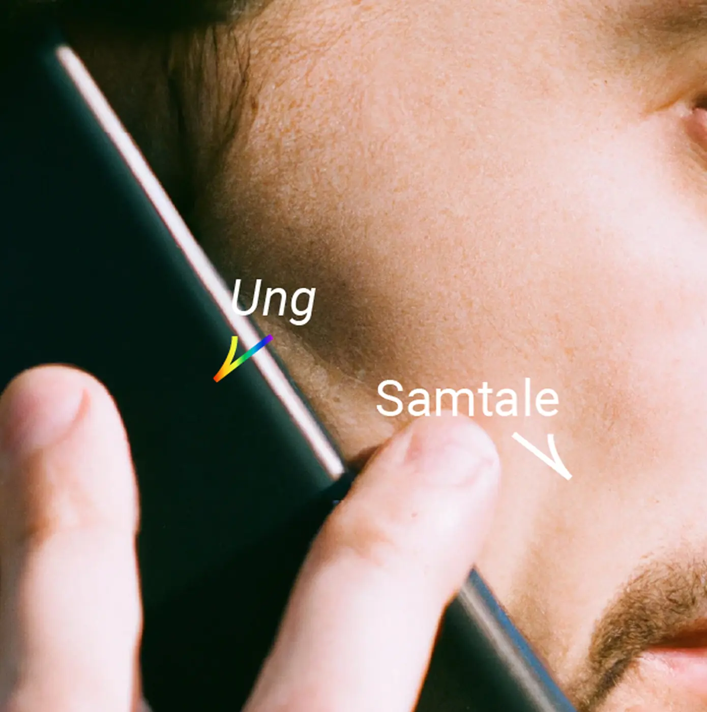
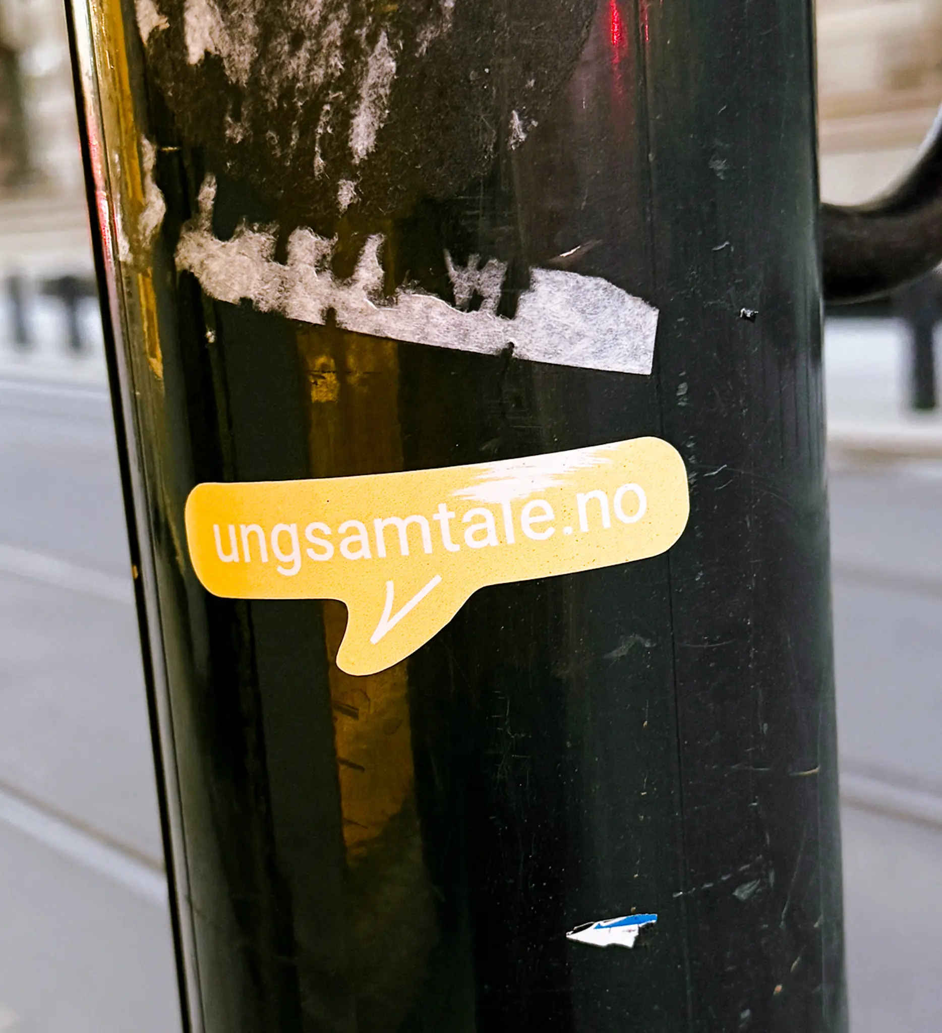
About
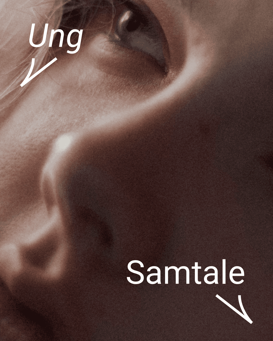
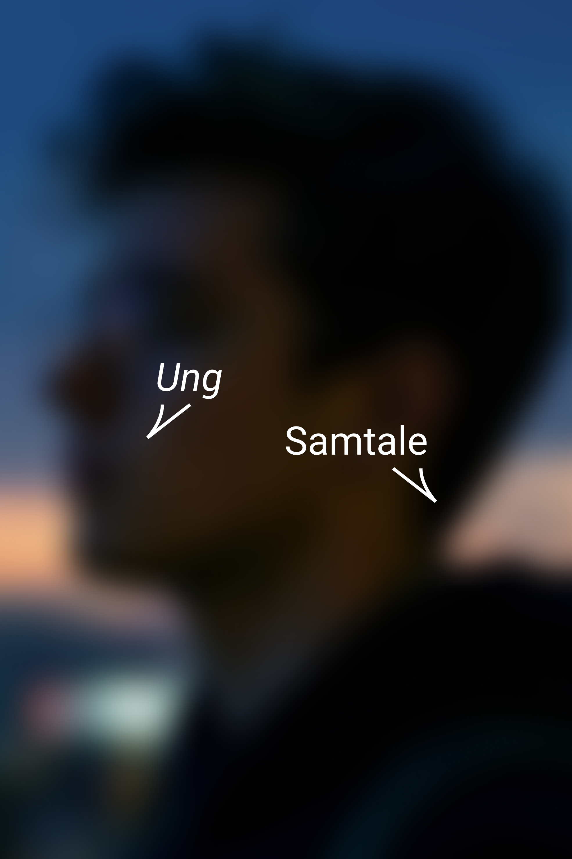
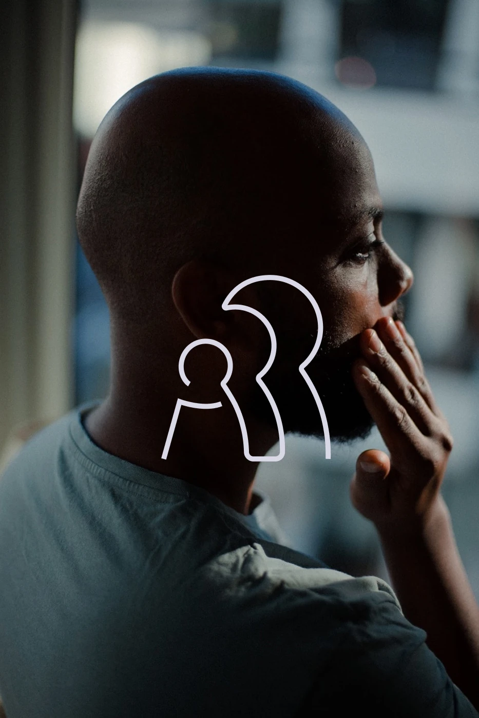
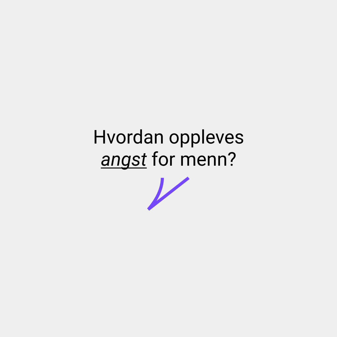
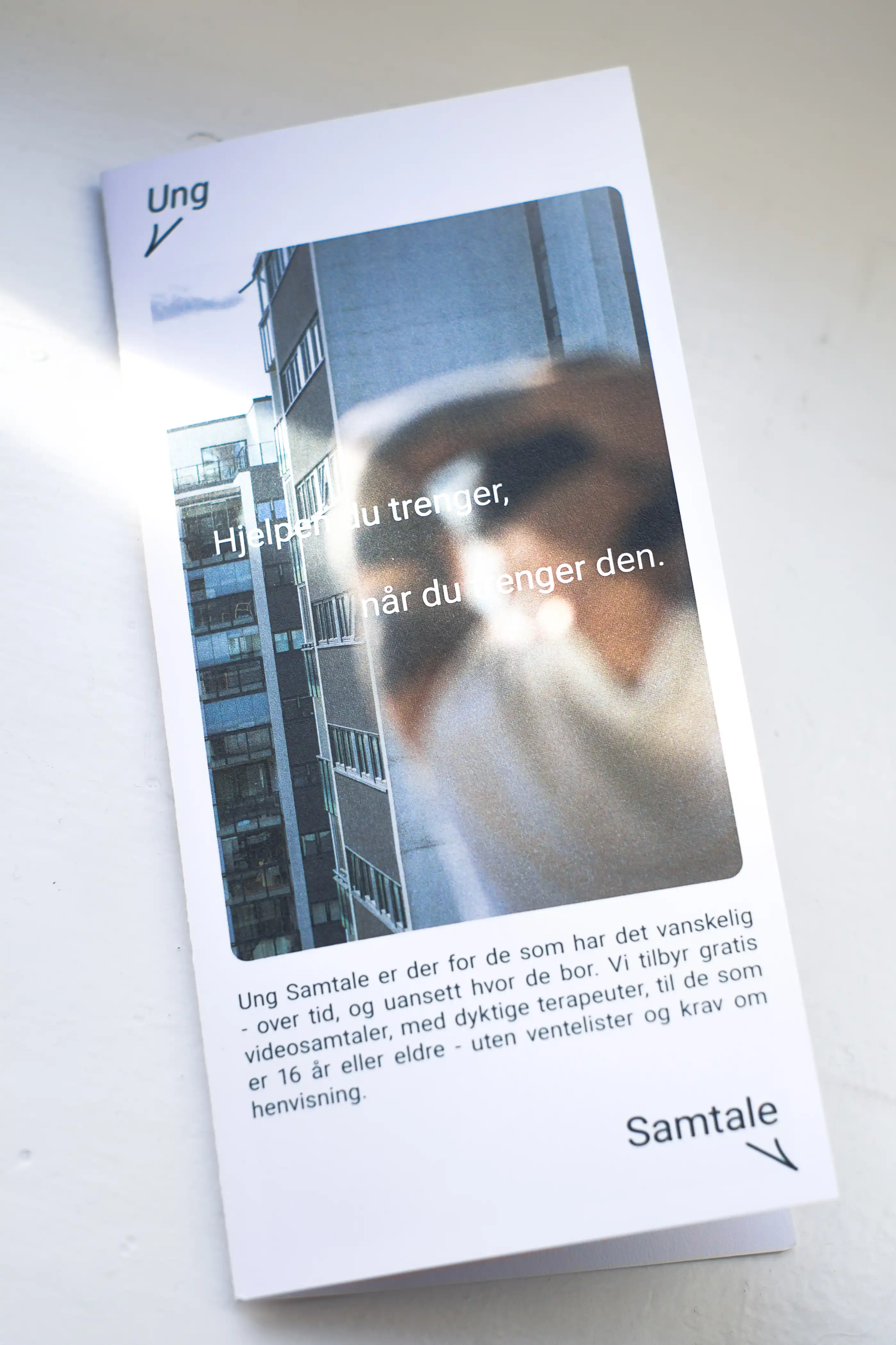
Ung Samtale provides low-threshold counselling for young adults facing mental health challenges while supporting the training of future clinical professionals.
Ung Samtale
HERE WHEN YOU NEED US
Services
Brand strategy
Web design
Art Direction
Visual identity
About
Ung Samtale provides low-threshold counselling for young adults facing mental health challenges while supporting the training of future clinical professionals.
Ung Samtale
HERE WHEN YOU NEED US
Services
Brand strategy
Web design
Art Direction
Visual identity
About
Ung Samtale provides low-threshold counselling for young adults facing mental health challenges while supporting the training of future clinical professionals.
Ung Samtale
HERE WHEN YOU NEED US
Services
Brand strategy
Web design
Art Direction
Visual identity
About
Ung Samtale provides low-threshold counselling for young adults facing mental health challenges while supporting the training of future clinical professionals.
Ung Samtale
HERE WHEN YOU NEED US
Services
Brand strategy
Web design
Art Direction
Visual identity

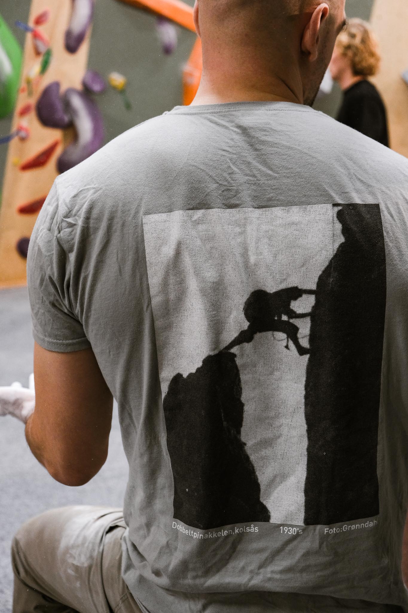
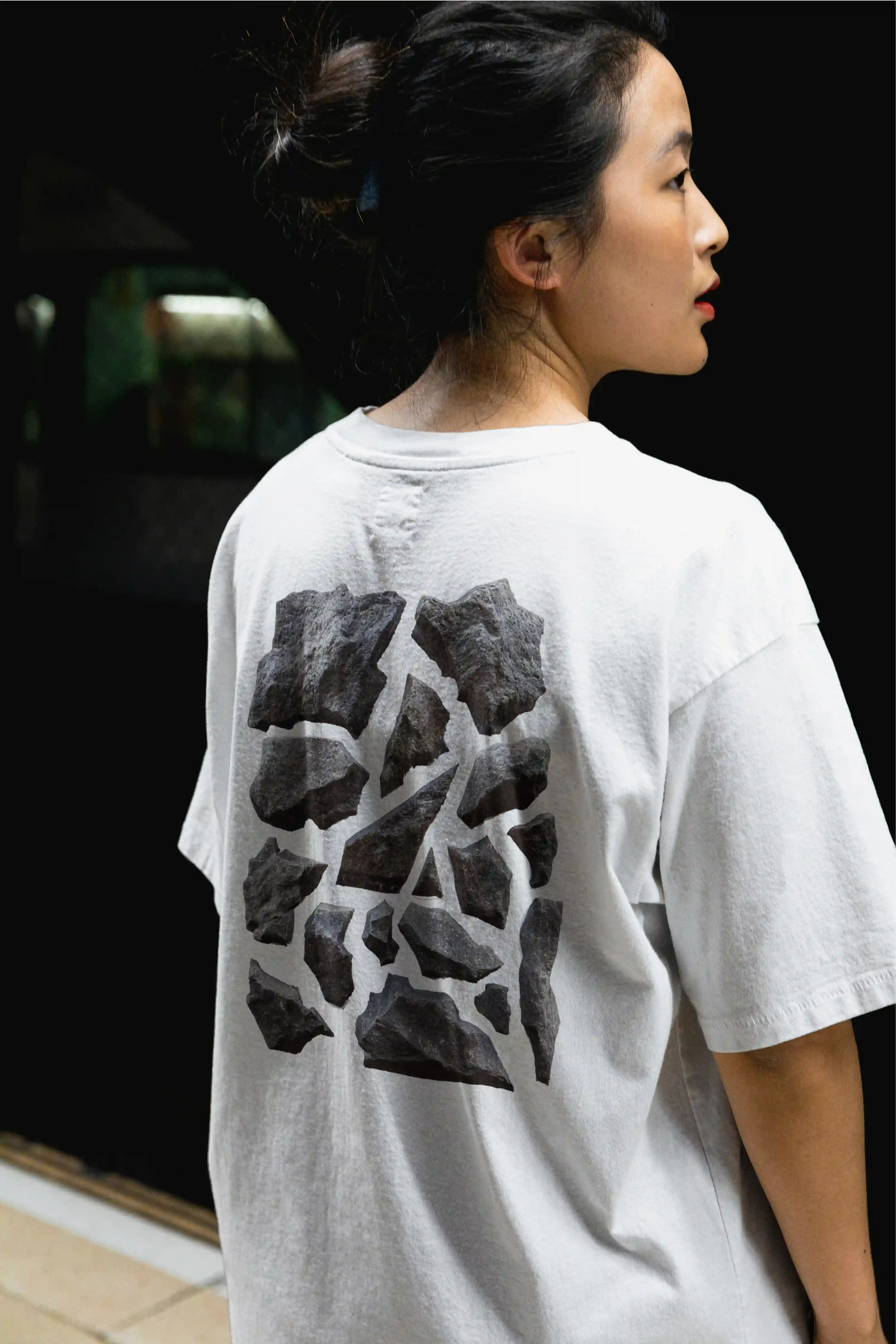
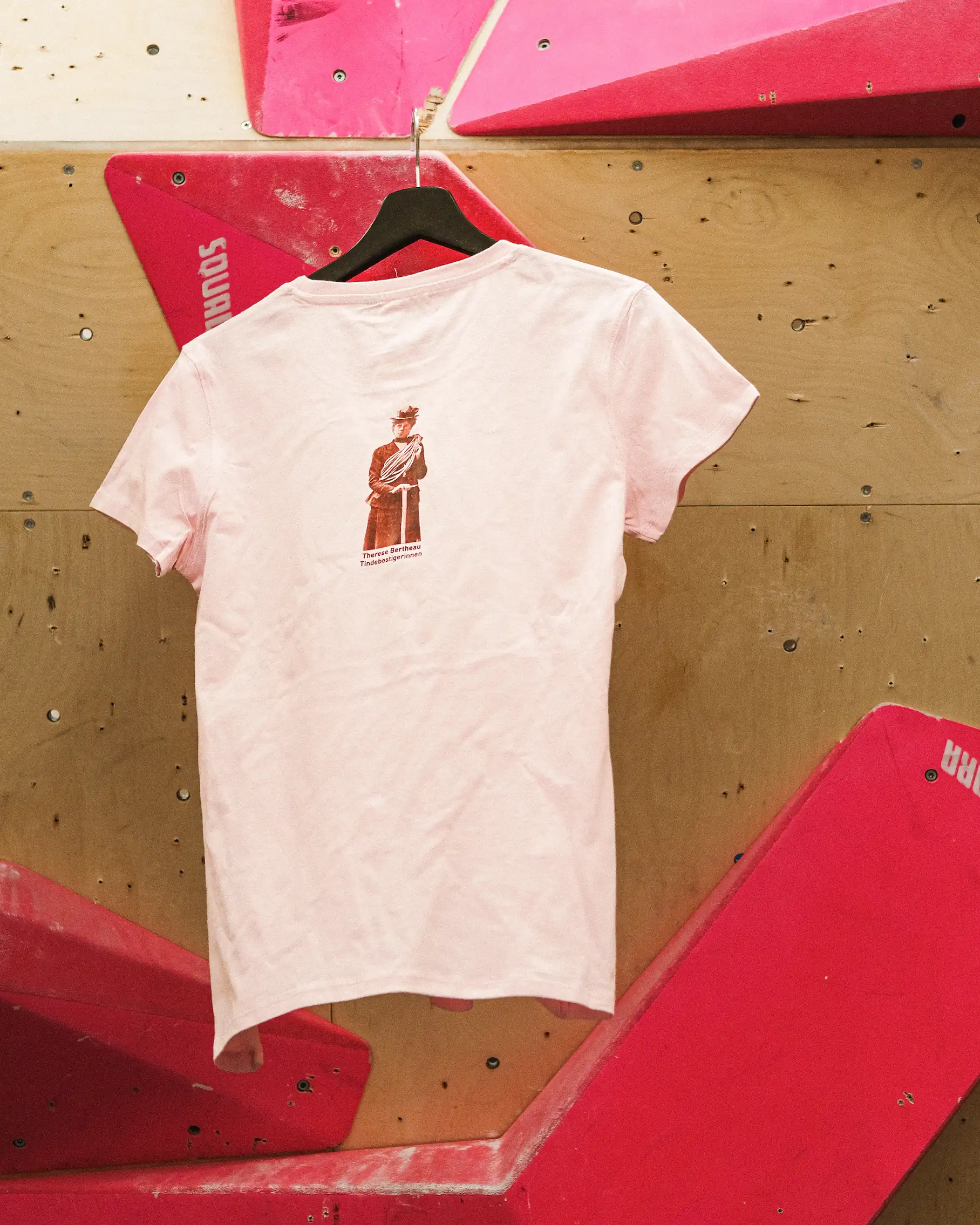
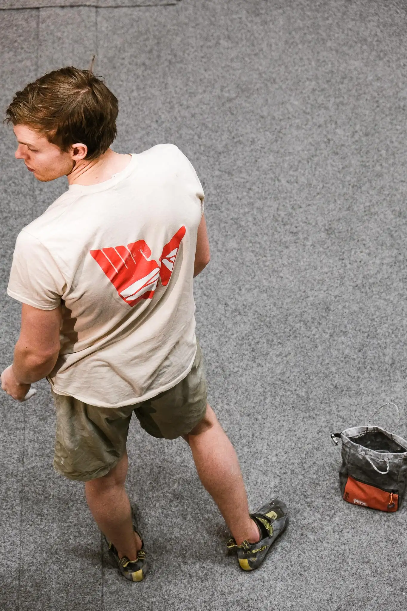
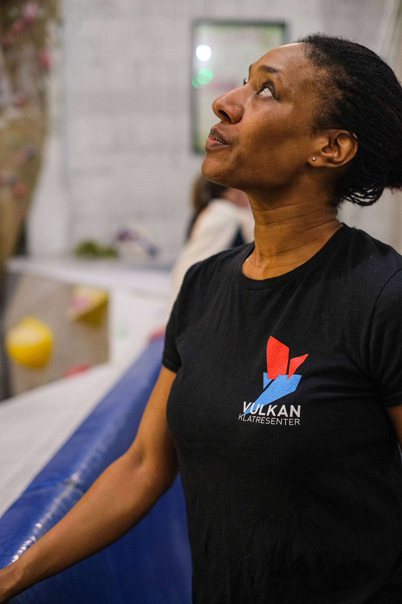
About
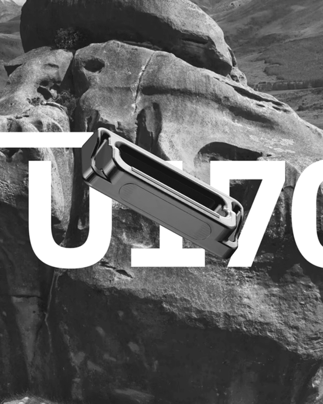
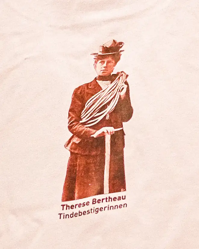
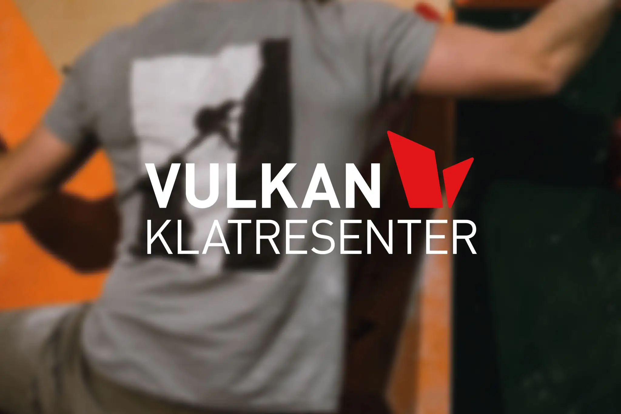
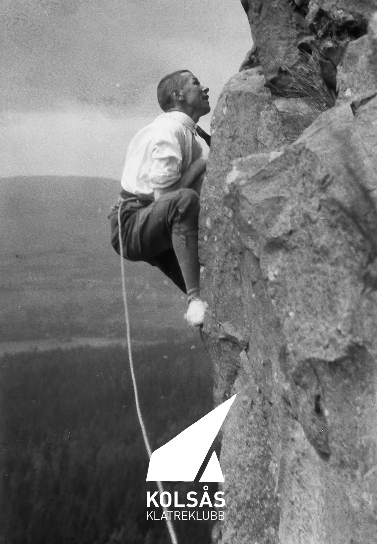
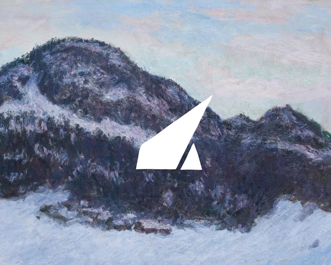
Redesigning Vulkan Klatresenter to seamlessly integrate its partnership with Kolsås Climbing Club while expanding the Kolsås brand itself.
Kolsås X Vulkan
A CLIMBING LEGACY
Services
Concept development
Visual identity
About
Redesigning Vulkan Klatresenter to seamlessly integrate its partnership with Kolsås Climbing Club while expanding the Kolsås brand itself.
Kolsås X Vulkan
A CLIMBING LEGACY
Services
Concept development
Visual identity
About
Redesigning Vulkan Klatresenter to seamlessly integrate its partnership with Kolsås Climbing Club while expanding the Kolsås brand itself.
Kolsås X Vulkan
A CLIMBING LEGACY
Services
Concept development
Visual identity
About
Redesigning Vulkan Klatresenter to seamlessly integrate its partnership with Kolsås Climbing Club while expanding the Kolsås brand itself.
Kolsås X Vulkan
A CLIMBING LEGACY
Services
Concept development
Visual identity

Coming soon

A new sprawling dance festival uniting dancers and perfomers around the world.
Your next favorite hang out spot and guilty pleasure
The most exciting place to hangout in Oslo, which happens to be a climbing gym
Move forward with ambition.
Start the conversation.